

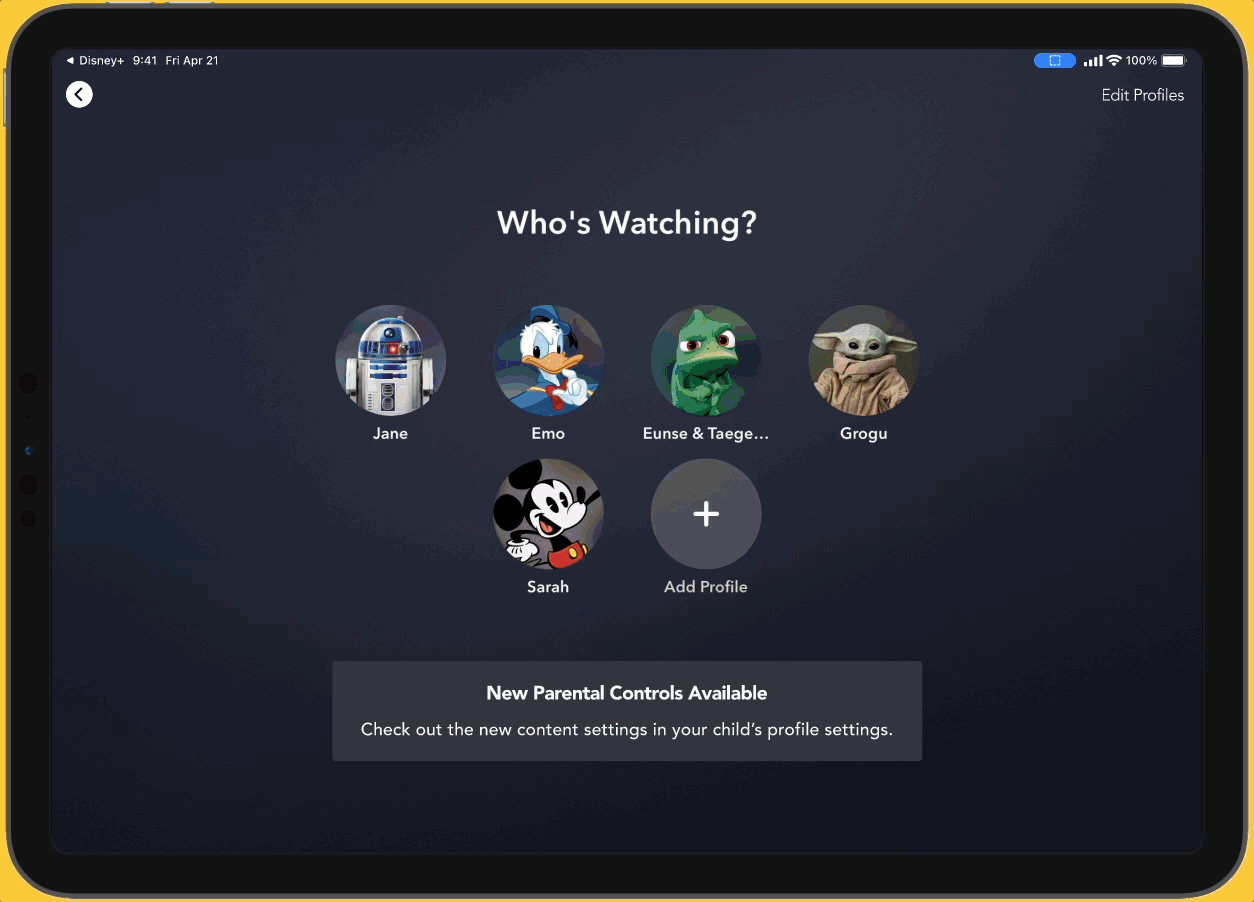
Disney+
A feature that helps parents trust the content their children have access to on Disney+ to be appropriate for their children.
Project type: Adding a feature
Role: Sole UX researcher + designer (with support from my mentor, Ayelén Malaquín, and design critique facilitator, Amber KB Wilson)
Industry: Entertainment, Family
Tools: Figma, FigJam, Zoom, Notion, Google Sheets
Duration: Q2 2023
*Note: This was a conceptual project and is unaffiliated with Disney Plus.
Retaining existing subscribers
DISCOVER
The business problem + context
First loss since its launch in November 2019.
Primarily due to Disney+ Hotstar’s loss of streaming rights for the Indian Premier League cricket matches.
The streaming service is yet to be profitable due to investment in content creation.
Focusing on the parents
Disney+ lost 2.4 million subscribers in the last quarter of 2022.
Before considering ways to gain new subscribers, we want to consider how we might retain existing subscribers.
45% of all Disney+ users are under 18 years old. We assume these users are part of family units. Therefore, we focused on Disney+ users who were parents of young children.


Research goal
We need to determine the context in which family unit users access Disney+ to discover if there are any problems that impact user satisfaction in order to decrease churning.
Research objectives
We need to determine the context in which family units access streaming services.
We need to determine how family units watch streaming programs.
We need to learn why family units subscribe to streaming services.
We need to learn what Disney+ offers its users.
Is Disney+ user friendly?
Preparing for user interviews

Usability heuristic evaluation
I needed to familiarize myself with Disney+’s existing features and how they worked or didn’t work. I used Nielsen Norman Group’s usability heuristics to evaluate the Disney+ website and app.
Screenshot of the existing Disney+ platform.
Possible usability concerns
Text can’t be enlarged or color contrast raised.
Can’t remove shows from the Continue Watching list.
The button for viewing information about a show in the Continue Watching section is not easy to identify.
No shortcuts for experienced users.
Hidden information: help section, parental controls, autoplay controls
Help takes users outside of the Disney+ window or app.
Familiarizing myself with the family streaming experience


In addition to Disney+, I reviewed features specific for families across the 3 popular streaming services: Netflix, HBOMax, and Hulu.
I tried the following actions:
Create children’s accounts (under and over 13 years old).
Compare a child’s home screen with an adult’s home screen.
Explore content restriction options.
Attempt to adjust content restrictions without a parent log-in.
Do parents have problems with streaming services?
Getting to know our users
I interviewed 5 parents of Disney+ users who are under 10 years old to determine if there are problems that they face when using streaming services with children. All research participants had at least 2 children under the age of 10.
Assumption: Parents of children under 10 years old are more involved in the streaming habits of their children.
Focus: Understanding the context in which families watched streaming shows and if there were problems that parents faced while using streaming services.


Affinity map of the user interview notes with highlighted user quotes. View the affinity map on FigJam.

Key user insights
Users do not feel comfortable with default kid profiles on streaming services because they do not trust all available content to be appropriate for their children.
Users do not want to encourage their children to watch media, however, they allow limited screen time routines with their children because users want to take a break or get other tasks done.
The goals the insights support
DEFINE
Identifying possible product goals
I used the key user insights to write POV and HMW statements which led to two possible product goals.
Insight: Users do not feel comfortable with default kid profiles on streaming services because they do not trust all available content to be appropriate for their children.
POV: I’d like to explore ways to help parents of young children who want to protect their children from inappropriate content on Disney+ to have more control over their children’s show/movie options because parents don’t trust Disney+ to filter content appropriately for their child.
HMW: How might we give parents of young children more control over their children’s Disney+ show/movie options to help parents trust Disney+ to be appropriate for their child?
Goal: Give users more control over their children’s show/movie options to help users trust Disney+ to be appropriate for their children.
Insight: Users do not want to encourage their children to watch media, however, they allow limited screen time routines with their children because users want to take a break or get other tasks done.
POV: I’d like to explore ways to help parents of young children who need time to get tasks done to enforce limited screen time routines with their children because parents don’t want their children to watch too much media but benefit from the distraction.
HMW: How might we help busy parents of young children to enforce screen time routines with their children to be able to limit screen time while benefiting from the time to get other tasks done?
Goal: Help users enforce screen time routines with their children to allow but limit their children’s screen time.
Researching with a narrowed scope
Research on research
I started my second round of research by looking into existing research on the relationship between children and streaming services.
Children’s impact on subscribership
Young children tend to engage in repeat viewing and have higher franchise loyalty.
A household is more likely to keep a subscription is if their child is engaged on that streaming service.
Screen time and children
The American Academy of Pediatrics recommends:
No screen time until 18-24 months
Ages 2-5: 1 hour or less
More screen time for 2-3 year old children was linked to poor test performance for behavioral, cognitive, and social development.
Parents of older children should negotiate limits and boundaries for screen usage.
Competitive Research: Round 2
Based on the user interviews, I revised the list of competitors to include Amazon Prime Video and YouTube Kids. I then reevaluated each streaming service with the following questions in mind:
In what ways can users control their children’s show options?
How are kids' profiles different from adult profiles?
What safeguards are available to prevent children from accessing adult content?
Can users limit screen time?
Competitive analysis comparing parental controls of 5 streaming services, including Disney+.
Using the research to influence the solution ideation
I used the potential product goals and secondary research to brainstorm solution ideas. Most of the solution ideas were derived by taking what other streaming services were doing well and making them more specific for our user needs.
For the scope of the project, I chose to move forward with the first product goal because it was more strongly supported by the research.
The solution
A feature that allows parents to curate specific titles, series, and/or collections for their child’s Disney+ profile to limit the content to those that have been approved by the parent.
So if a parent feels that their child is ready to watch Star Wars, the parents could unlock it despite the content rating.

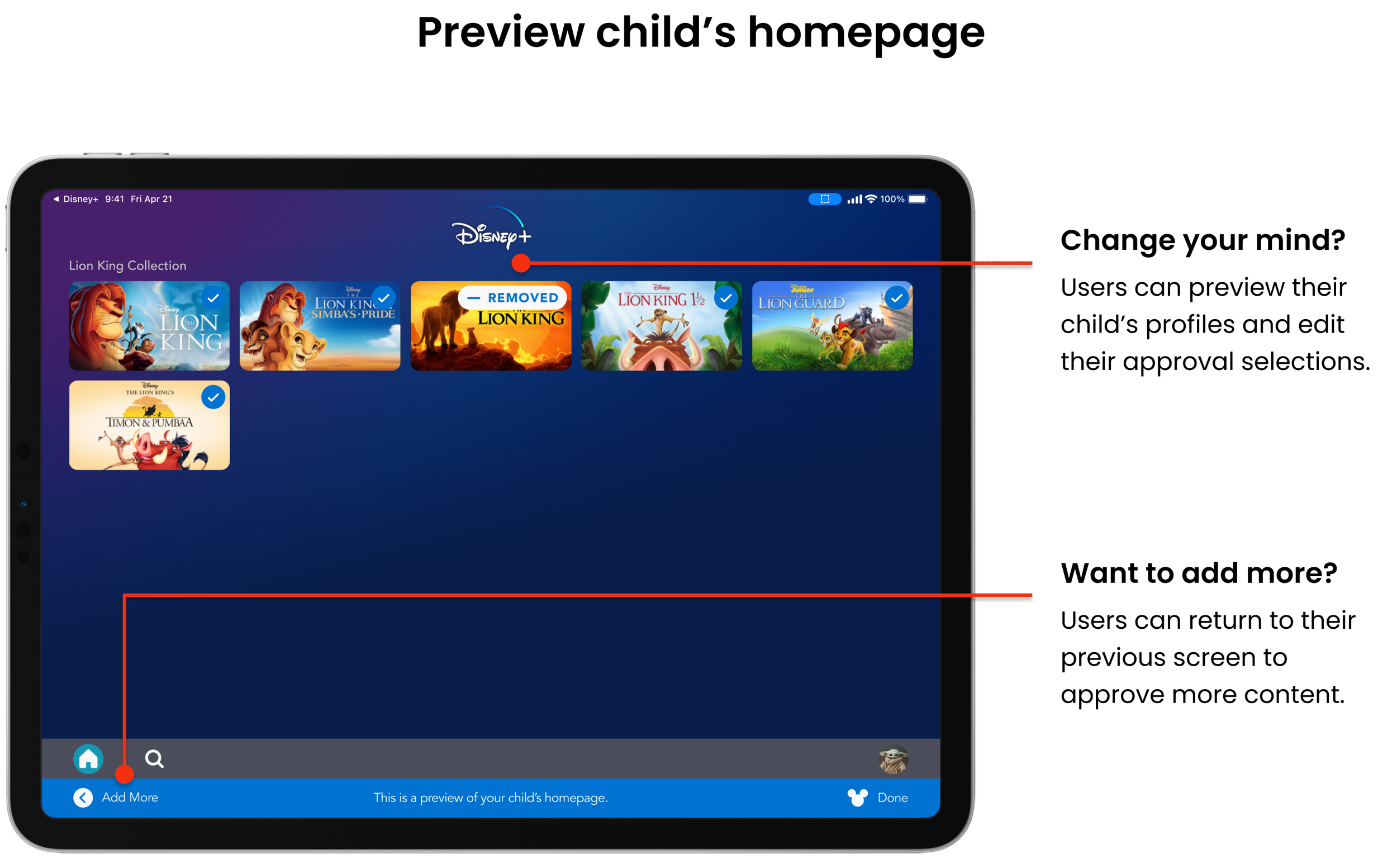
Change isn’t always good
DEVELOP
Building on existing structures
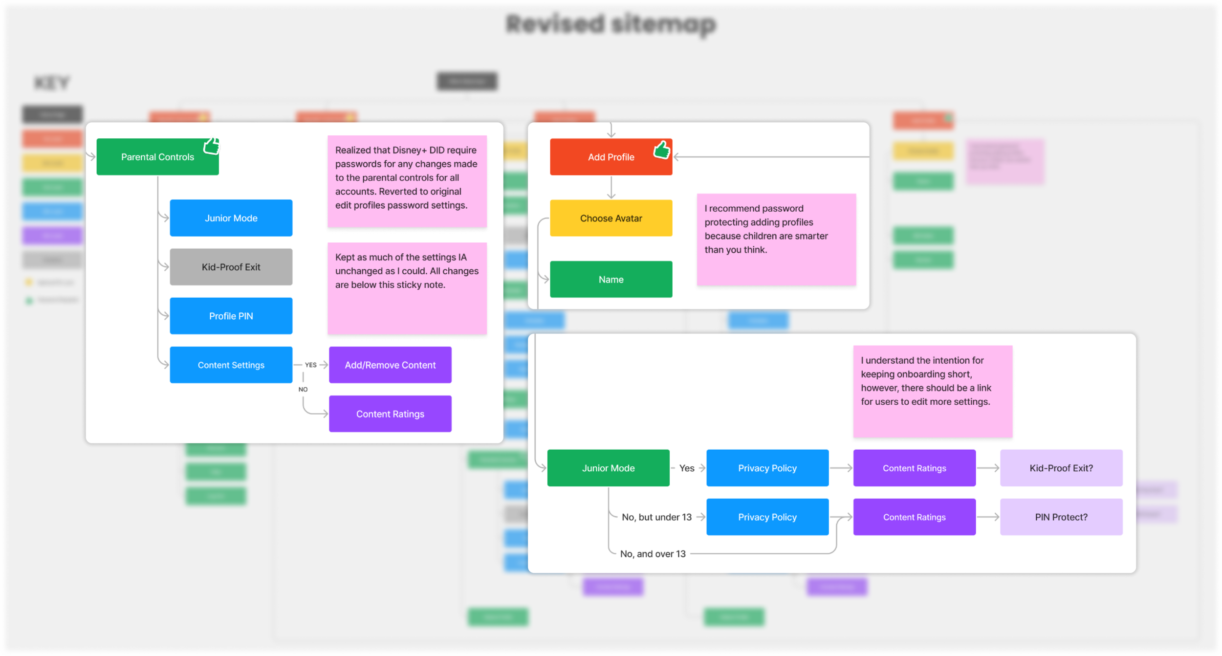
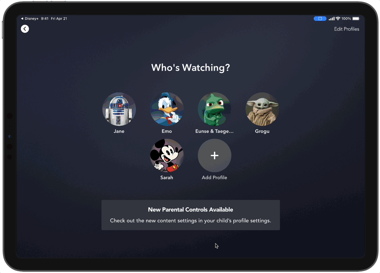
I started by creating the sitemap of the existing app. Then, I brain-dumped my changes on top of the existing sitemap. I spent a lot of energy building out the Add Profile (onboarding) screens. But then, I realized that onboarding is concise on purpose! So I went back to the existing sitemap and tried to make as few changes and renames as possible.
What is the minimum I can change for maximum gains?
Add a shortcut to Edit More Settings within the onboarding process.
Expand the Content Rating settings to include the Approved Content Only option.
Password protect adding profiles because children are smarter than we think.


I dug too deep!
I got lost in the Disney+ content maze
After developing the general task flow for parents to approve content for their children, I started working out the user flow and got lost in the Disney+ content maze. Disney+ is a complex app with a lot of ways for users to access content. Trying to add a feature that can be embedded in nearly every screen of the app sent me down a whirlwind.

The first iteration of the unusable monster of a user flow.
Designers to the rescue!
Thankfully, I had peers and mentors who pulled me out of my hole by reminding me that the user flow should be a useful communication tool. My monster of a user flow was neither helpful for me nor for potential team members and stakeholders to make sense of the new feature.
Specificity for clearer communication
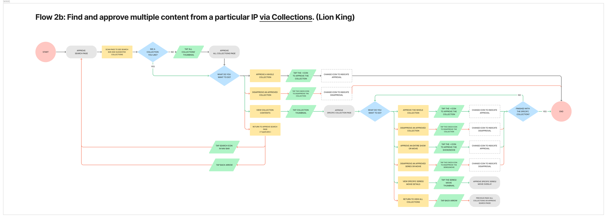
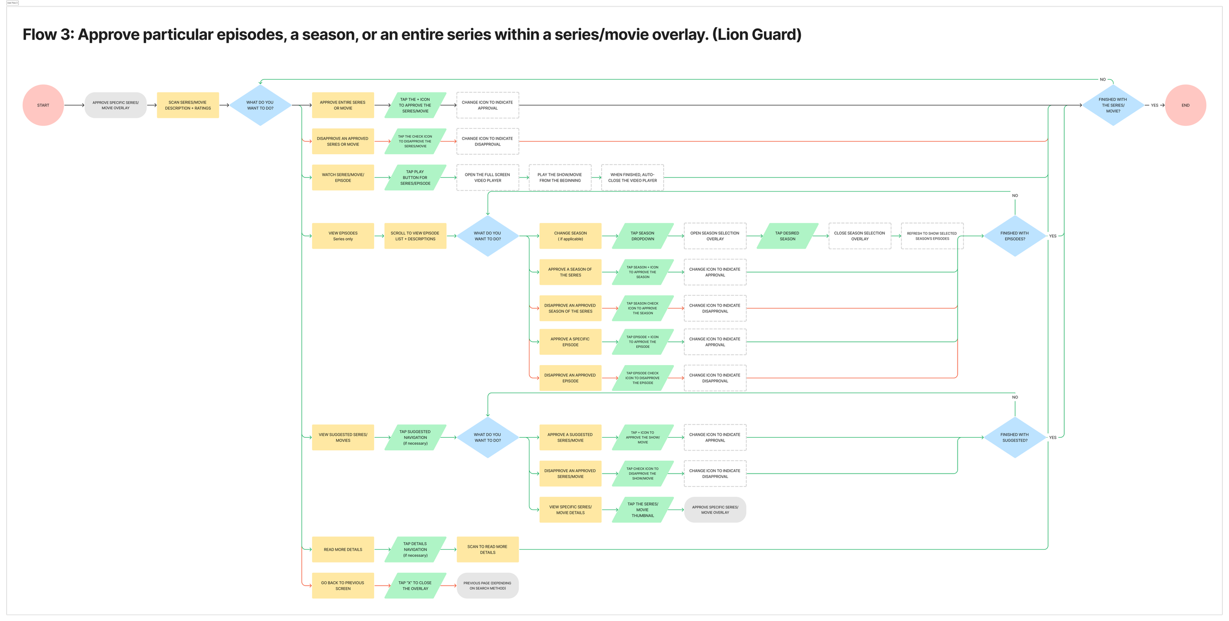
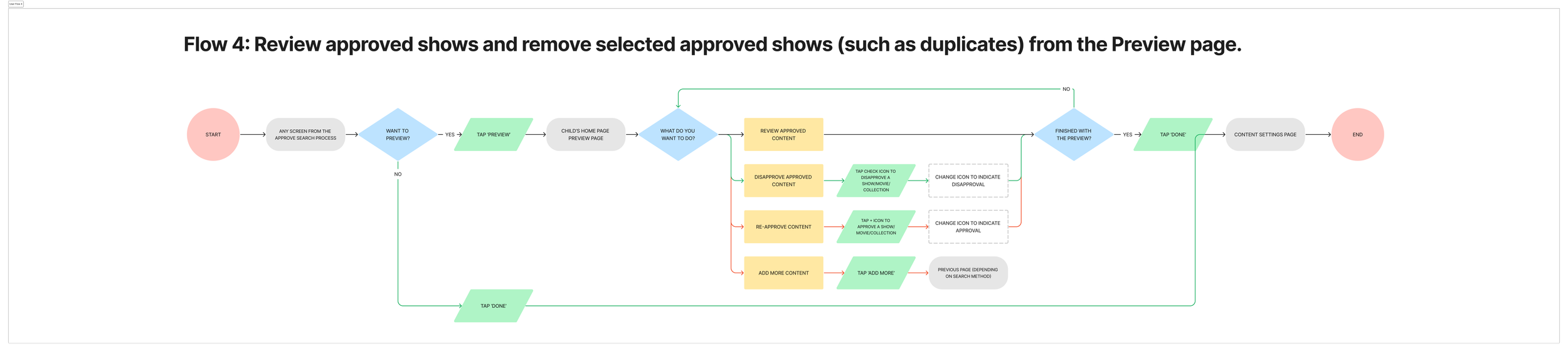
Rather than trying to capture all possible pathways within Disney+, I broke down the single monster of a user flow into 6 smaller, more specific user flows that would become the flows that would eventually be usability tested. This helped to define the feature set for this new feature.
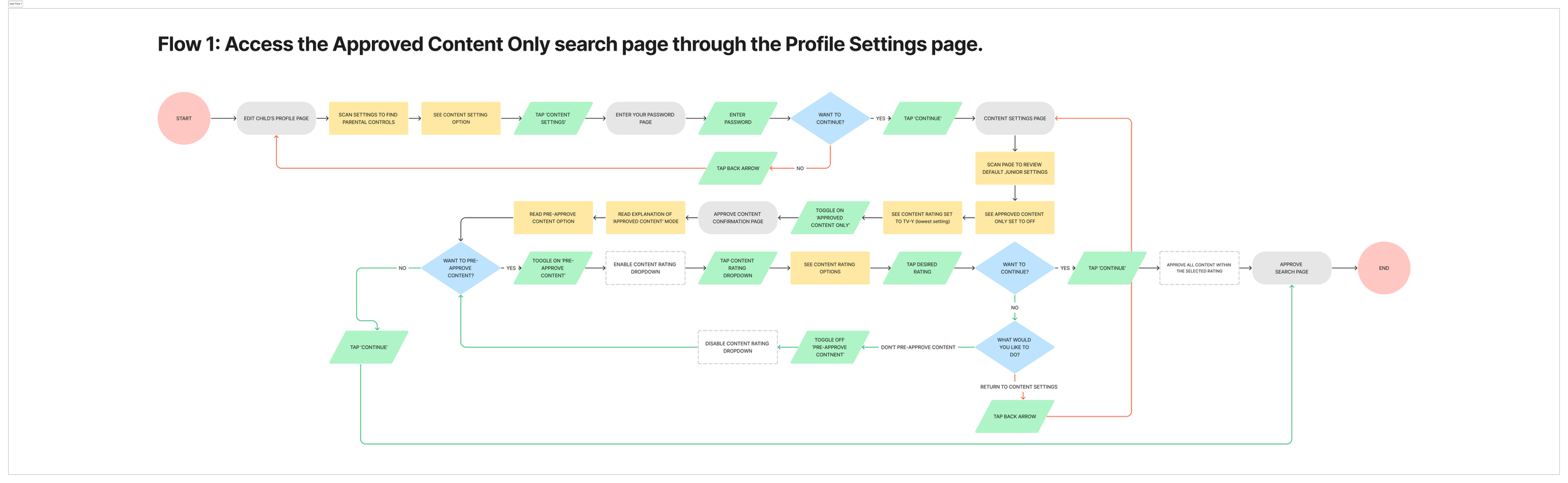
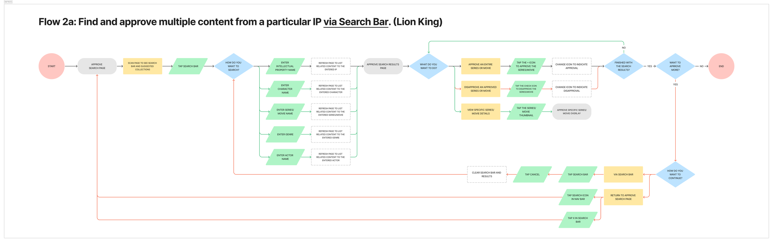

What will approving content look like?
Frankenstein wireframing
Since my goal is to build on what already exists with minimal changes, I decided to wireframe by annotating the existing screens. I cut and pasted existing text packaging and components with notes on how they would be adapted for the new feature. As for anything that didn’t exist in Disney+, I used screenshots of competitors’ similar screens and elements for reference.
Portion of the annotated screenshot wireframe. View annotated wireframe on Figma.
So what’s new?
The only new components for the Approve Content feature are the approval button and navigation bars. All other elements are built off of the existing design system.
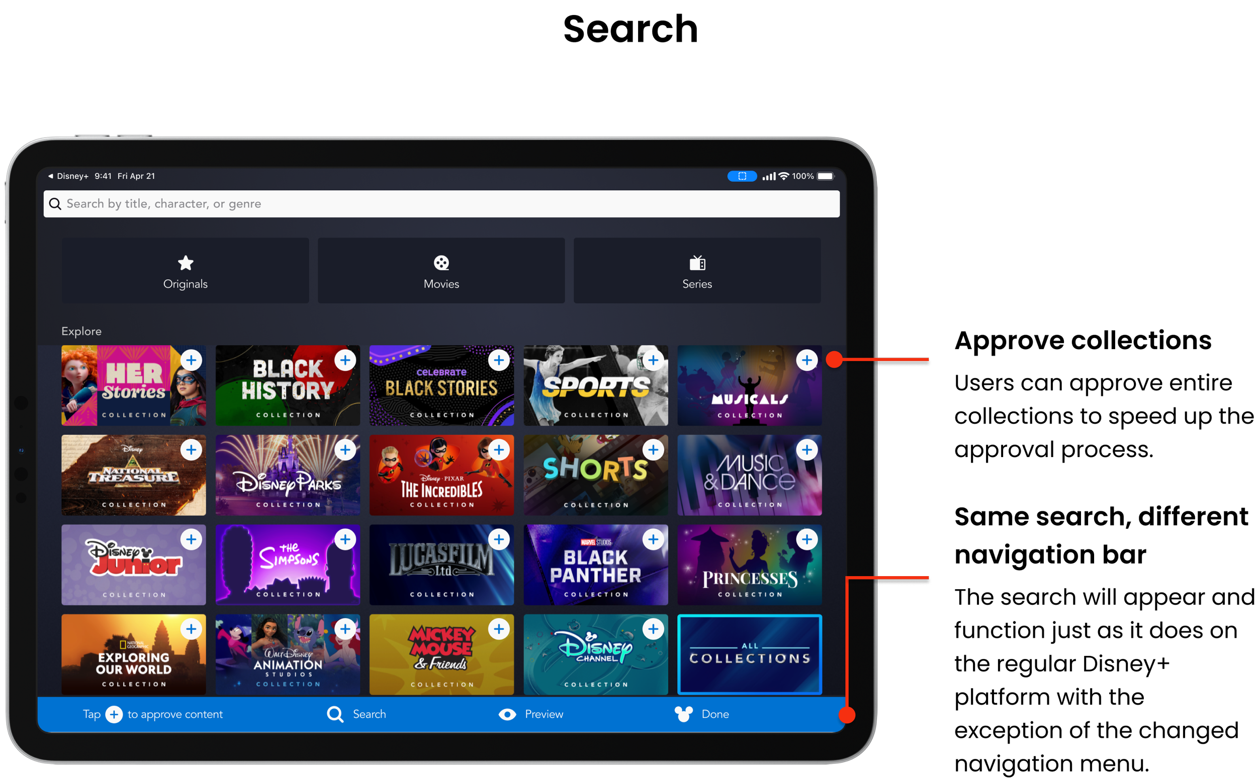
The navigation bar
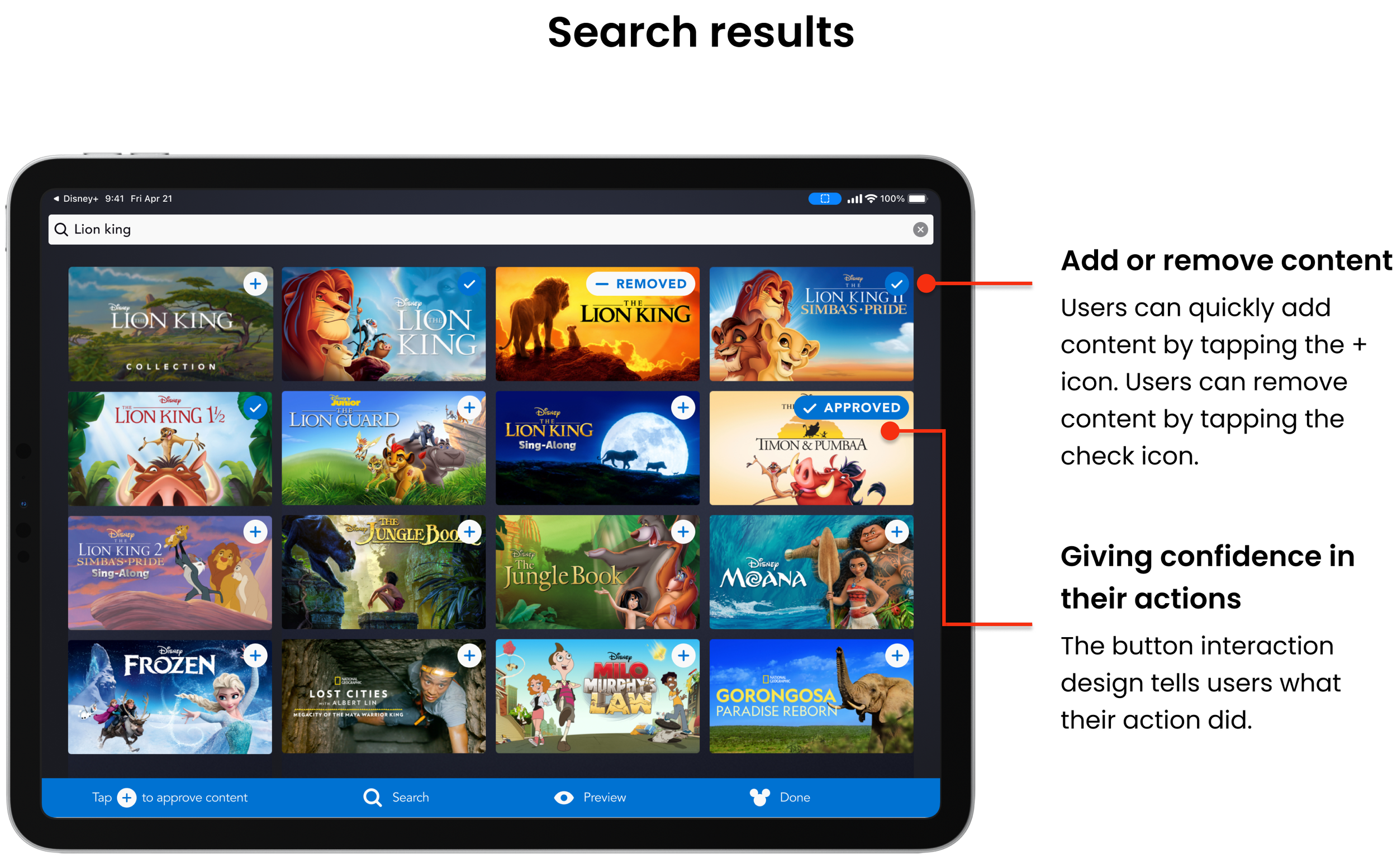
The button

How could I signify adding and removing approved content within the smallest amount of real estate?
Took inspiration from YouTube Kid’s Add to Collection button.
Changed the word choice to more clearly state the action taken, including removing a pre-approved selection.
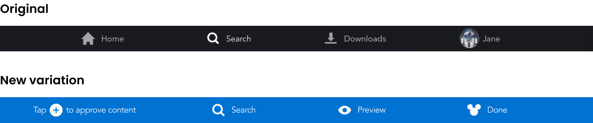
How could I mimic the existing navigation while signifying to the user that they are in Approve Content mode?
Same placement along the bottom of the screen
Common icons and spacing
Contrasting vibrant color to differentiate from the normal navigation menu.
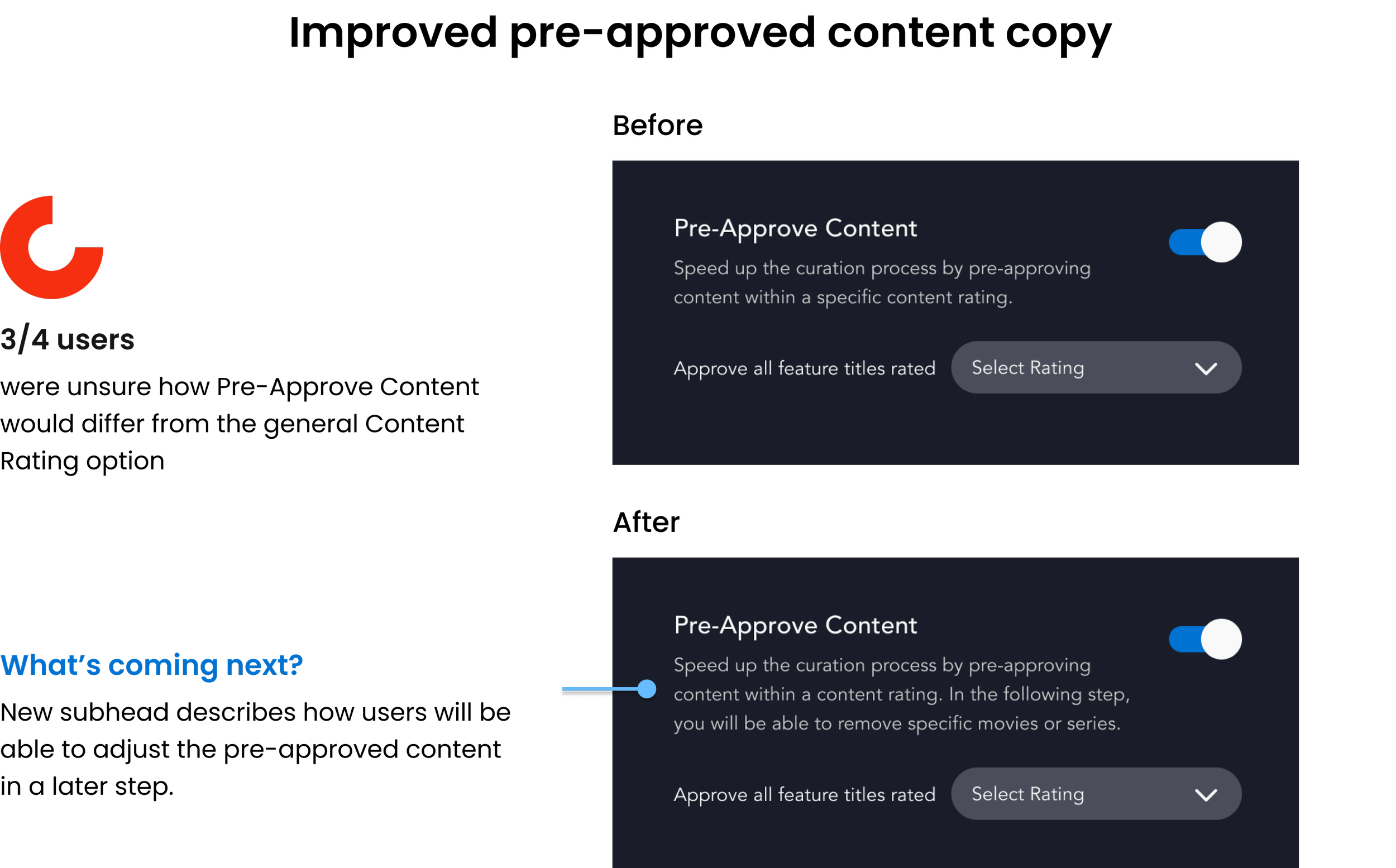
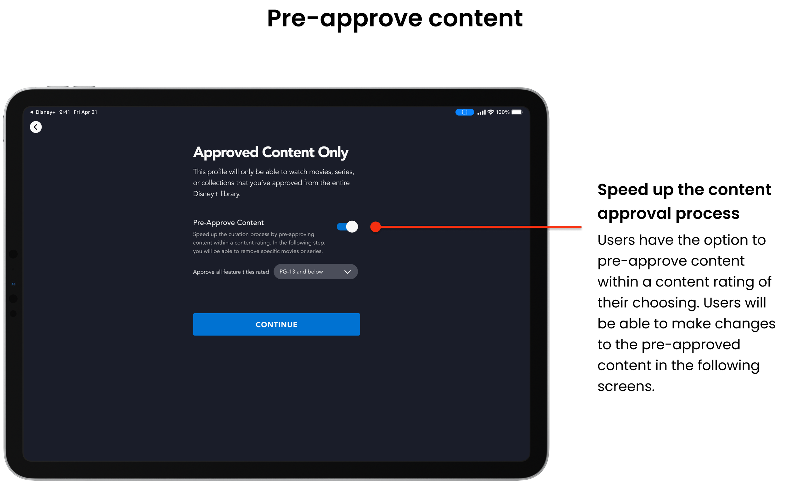
Accommodating busy parents with pre-approved content
While giving parents ultimate control over all content on their children’s accounts is ideal, our user insights showed that parents are busy. So I added a preliminary screen to the Approve Content flow that allows parents to pre-approve content within a particular content rating to speed up the content approval process. Parents will still be able to adjust the selection by adding to or removing any content they pre-approved.
Let’s put it to the test
Tasks for usability testing
Access the Approved Content Only search page through the Profile Settings page.
Find and approve multiple content from a particular IP (Lion King).
Access show details and approve particular episodes, a season, or an entire series (Lion Guard).
Remove approved shows within the Junior Profile Preview.
Revisit feature settings.

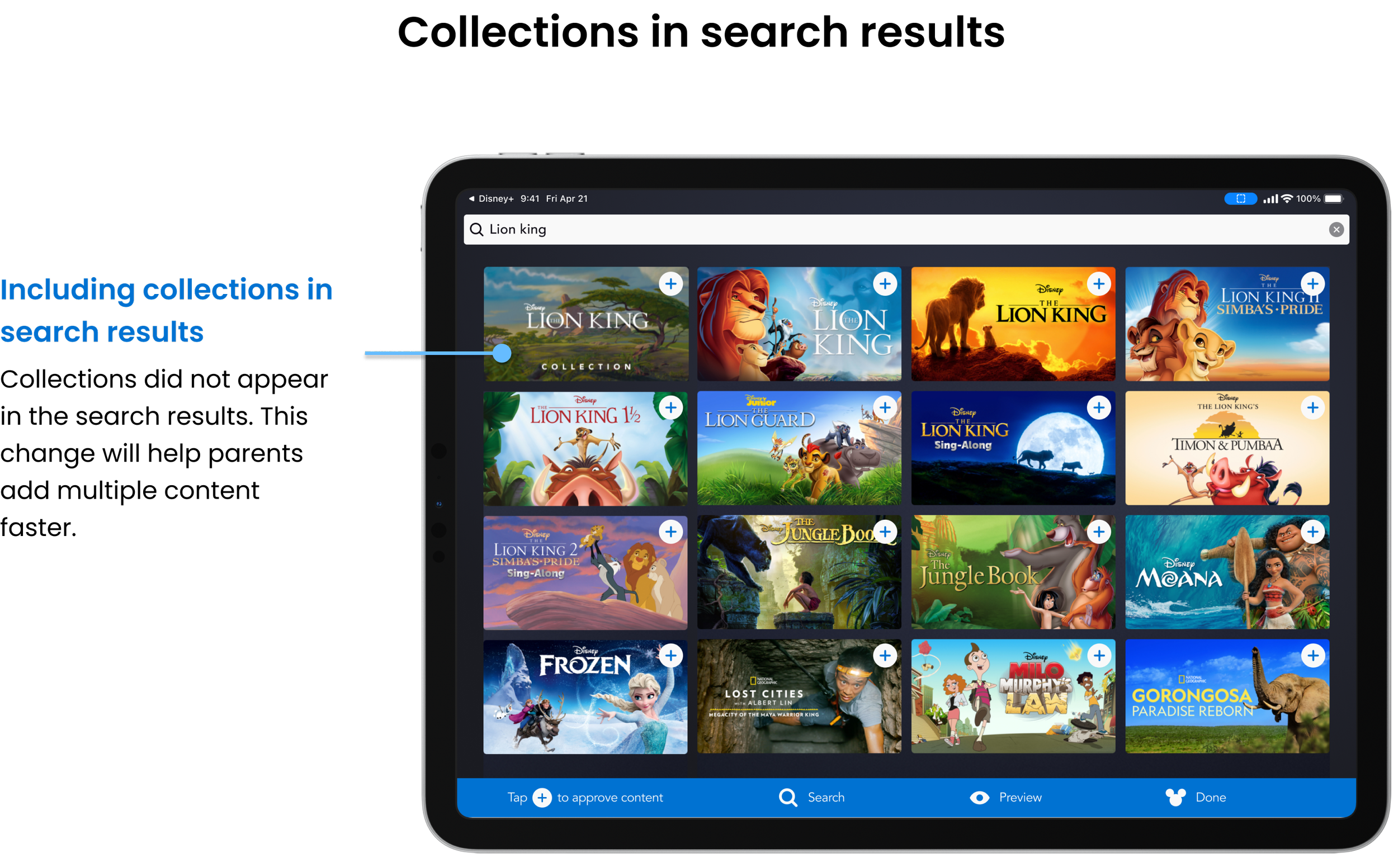
Testing the prototype
Conducted moderated usability tests with 4 parents of young children via Zoom.
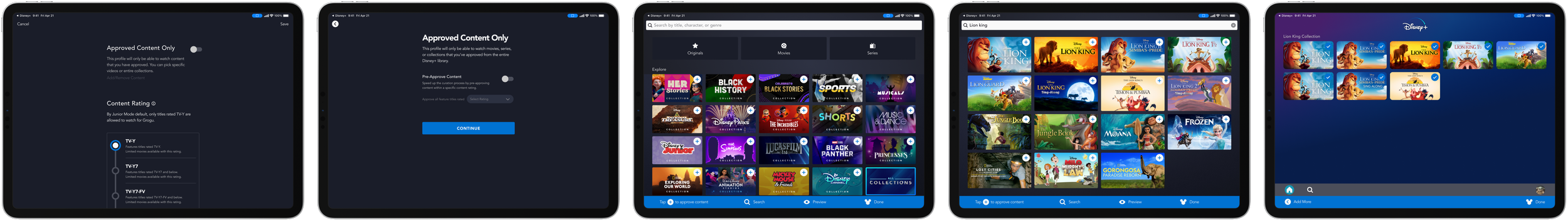
Tablets showing prototype screens for content settings, approved content only, search, search results, and preview.
Iterating based on usability test results


Priority revisions
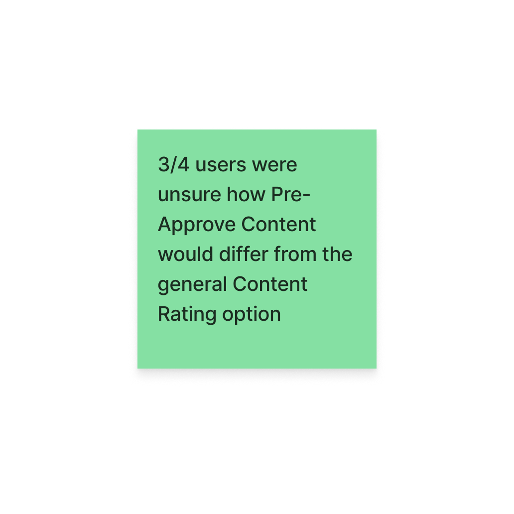
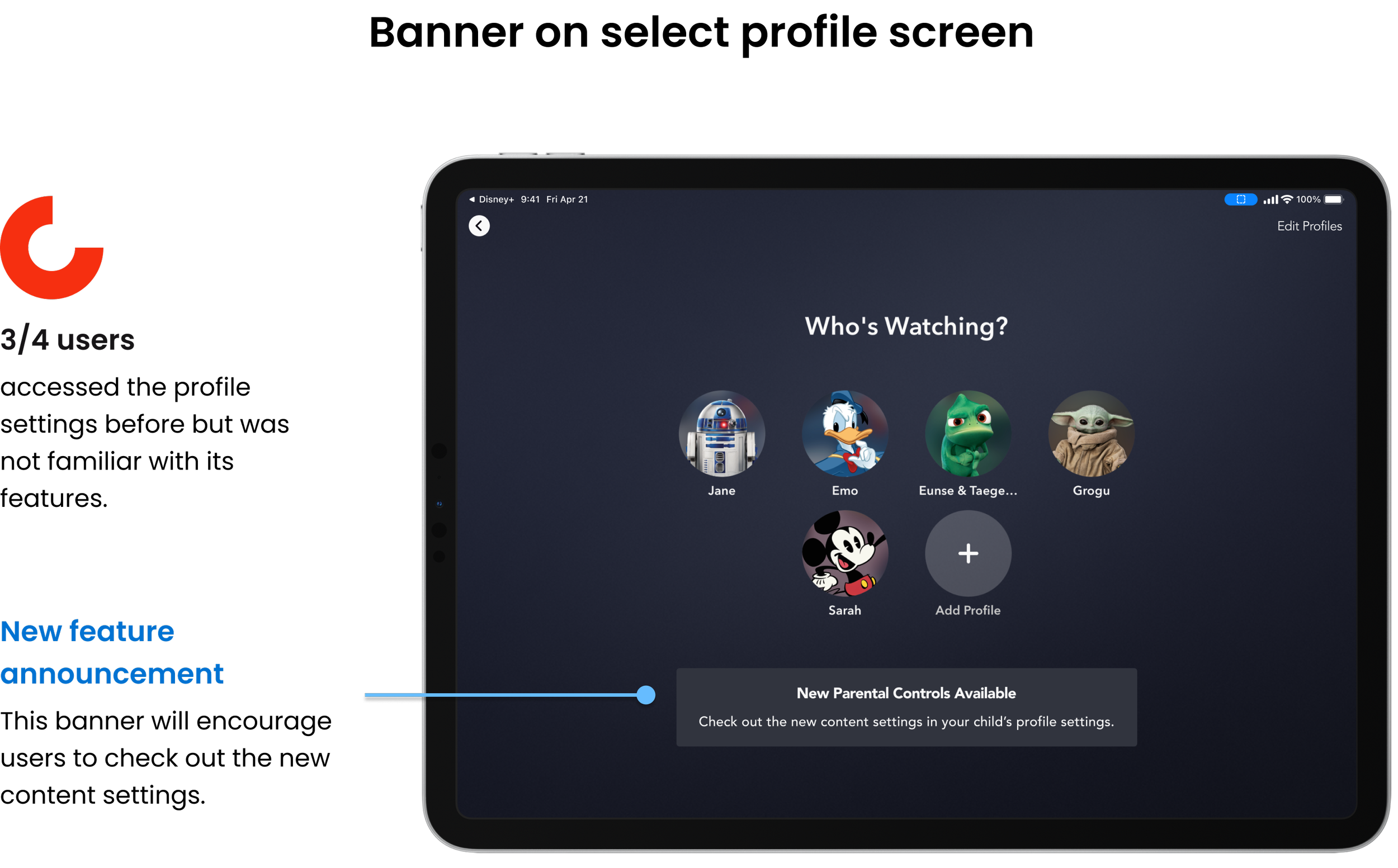
Overall the general flow and the Add/Remove iconography were easy for the users to follow. Most other hiccups in the usability testing occurred on an individual level. However, one thing that 3/4 users were not able to differentiate were Content Ratings and Pre-Approving Content. Also, 3/4 users stated that they were unfamiliar with the profile settings because they never revisited them after initially setting up the profiles.

Allowing parents to curate the content on their child’s Disney+ profiles
DELIVER
How does the Approve Content feature address user needs?
The problem: Parents do not feel comfortable with default kid profiles on streaming services because they do not trust all available content to be appropriate for their children.
The solution: A feature that allows parents to curate specific titles, series, and/or collections for their child’s Disney+ profile to limit the content to those that have been approved by the parent.


View the revised prototype
Prototype walk-through of the content approval feature.
Where do we go from here?
Ideas that require cross-functional buy-in
The following ideas came up while developing the Approve Content feature however, these ideas may require cross-functional buy-in since they will have more overarching impacts across the Disney+ platform.
Search filters
Parents expressed that they are not always aware of the content rating or themes of the content that their children watch, especially for newer releases. Filters could allow parents to filter the search results without having to view the show details for every option.
Approving shows while in the adult profile
Keeping parents’ busy lives in mind, could we allow parents to approve content without having to go into the setting for each of their children? Maybe we could add to the existing Watchlist feature?
Block specific content
Again, parents are busy. If they don’t know what they want, they likely will know what they don’t want. How might parents block specific content such as language, themes, genres, or characters?
What I learned
I thrive within constraints. I loved finding ways to use existing design elements to create the components I needed for the Approve Content feature. Being limited by the existing typography and color palette allowed me to focus on the functionality rather than the appearance.
Least to do the most mindset. From brainstorming solutions to the information architecture to wireframing, I started each process with a brain dump but improvements happened once I focused on finding the smallest changes I could make to make the biggest impacts toward the product goal.
NEXT PROJECT

End-to-end responsive website + branding