


A small business beauty store website to help people find products that are right for their hair care needs.
Project type: End-to-end responsive website + branding
Role: Sole UX/UI designer + brand designer (with support from my mentor, Ayelén Malaquín, and design critique facilitator, Amber KB Wilson)
Industry: E-commerce, Beauty
Tools: Figma, FigJam, Zoom, Notion
Duration: Q1 2023
A brick-and-mortar beauty supply store
DISCOVER
The store and it’s customers
Photo of the Glen Pro Beauty Center store front.
The Glen Pro Beauty Center’s owner has over 20 years of beauty supply store operating experience but has never had an online store.
Glen Pro Beauty Center sells a wide range of products for hair care, hair color, skincare, nail care, cosmetics, and beauty tools.
The majority of the store’s customers are regulars and the business doesn’t not frequently get new customers.
The business problem
Since the pandemic, Glen Pro Beauty Center has seen a significant drop in sales and needs to increase sales in order to remain in business.
GlenPro Beauty Center would like to open an online retail store in hopes of bringing in more revenue.
The owner would be building the website on his own via Shopify.
Why do customers shop in-store?

According to the owner,
Customers come to the physical store to receive product recommendations or confirmation if a product is right for them.
Recently, many customers come in based on product recommendations from influencers who don’t always give the most well-rounded advice.
Looking into the in-store + online experience
Research goal
Determine what to include on the shop’s website to help users successfully purchase a product online.
Research objectives

We need to learn how users determine where to purchase their beauty products.

We need to learn how users determine what products to purchase for their beauty needs.

We need to understand the process users go through when making a purchase online.
Getting to know our competitors


I compared the websites for a large beauty chain (Sephora), a medium beauty chain (Sally Beauty Supply), and a small beauty brand (Soko Glam). The key areas I focused on were how the companies supported users in finding the right products for their needs and what features they provided that may not be available in-store.
Sephora and Soko Glam offer text support and quizzes.
Help users determine if a product is right for their needs
Online alternative to asking for recommendations in-store
Sephora, Sally Beauty Supply, and Soko Glam include detailed descriptions in their product listings that may not be available in person.
Help users feel confident in purchasing products for the first time
How to use the products
Labels for clean/vegan products
Getting to know beauty shoppers
I interviewed 5 people who shop for beauty products online with varying levels of beauty product use. I conducted 4 interviews via Zoom and 1 in-person.
Expected outcomes
Understand the users’ habits when shopping in-store vs. online for beauty products.
Understand user’s habits for purchasing a product online from entering a website to checkout.
Determine how a product’s characteristics affect users’ shopping.
Affinity map of the user interview notes.
In-store shopping experience
5/5 users rely on sales reps to give recommendations for products based on product type or budget.
4/5 users like to try products or purchase travel-size products before committing to full-size products.
Online shopping experience
5/5 users rely on friends, influencers, and gift guides to recommend products.
4/5 users use features that allow you to narrow down options to make decision-making easier.
Product listing details that users value
5/5 users use photos and reviews to determine if a product is appropriate for their needs and concerns.
3/5 users look for specific ingredients in their products.
Observing shoppers in-person
I wanted to learn about the in-person interactions that set the in-store experience apart from a website experience. I watched 10 consecutive customer experiences from the moment they walked into the store until they walked out.

Photo of the inside of Glen Pro Beauty Center with patterns from the in-store observation. View in-store observation notes on Notion.

Key user insights
People who buy beauty products rely on sales reps and their peers for product recommendations and advice because they are overwhelmed by product options and need help to overcome choice paralysis.
People who buy beauty products online view product reviews and photos because they want confirmation that what they want to buy will be effective for their skin/hair goals.

What should we include on the store’s website?
DEFINE
Research Findings
We need to learn how users determine where to purchase their beauty products.
Users purchase new products in-store and repeat products online because they can test the products in-store before purchasing.
We need to learn how users determine what products to purchase for their beauty needs.
Users rely on sales reps, peers, and reviews to help narrow down their options and confirm their product choices.
We need to understand the process users go through when making a purchase online.
Due to the lack of sales personnel when online shopping, users rely on photos, reviews, and website recommendations.
How could we help users make a purchase?
Based on the research findings, users needed help in two areas. We used these two needs as our product goals moving forward.
Product goal 1: Help users narrow down product options to avoid choice paralysis
Product goal 2: Help users get confirmation that a product will be effective for their skin/hair goals.
Brainstorming solutions with the stakeholder
I presented the research findings to the store owner and confirmed the product goals. I created an in-store journey map based on my observations to use as a framework for brainstorming solution ideas with the owner. How might we address the in-store moments through the website?
Journey map of the in-store experience with the solution brainstorm completed with the store owner.
Struggling to find a feasible solution
Evaluating the solution ideas
I sorted the ideas based on user value and effort. User value was based on how well the idea addressed the product goals.
Solution evaluation based on user value and effort required.
The brainstorm wasn’t enough
At first, I focused on navigation, search features, and product listing details because they were low effort with high user value, and they felt the most feasible for the owner to follow through with. However, they did not address the product goals completely.
Is it realistic for the owner?


Navigation and search features were not enough. So I considered a shopping guide style FAQ page to help users decide what to purchase using the owner’s experience and expertise.
But when I considered the amount of copy content the owner would have to write to launch this page, it felt too daunting and unrealistic for the owner to do on his own.
Mimicking the competitors
Several competitors provided customers with quizzes to help give product suggestions. My assumption is that these are essentially guided filtering processes using the associated tags on the product listings like normal search filters. This felt like a more automated system that would be more sustainable for the owner.
How might we help users make a purchase?
MVP features for each product goal
Product goal 1: Help users narrow down product options to avoid choice paralysis.
Shopping Guide Quiz that guides users product recommendations and tips based on product type and/or concern.
Menu and search features to filter products based on brand, product type, concern, and/or price.
Recommended products on the home page.
Product goal 2: Help users get confirmation that a product will be effective for their skin/hair goals.
Users can read and leave reviews and questions for products.
Product listings will include ingredients and how to use the product.
Prioritizing the bestselling product category
DEVELOP
Sitemap: Copy and paste
I started building the sitemap by copying Sephora’s structure and label copy since they were a well-established competitor that sold similar products. I added the shopping guide quizzes for makeup, hair, skincare, and beauty tools. Then I started the pruning process. What was absolutely necessary for Glen Pro Beauty Center’s website to launch while meeting user needs?
Focusing on hair products first
Glen Pro Beauty Center sells a wide range of products, but trying to design a website to house all product types upon launch was unrealistic. Since most of their sales were for hair care and color products, I recommended that we launch the website with only hair-related products. Then with time, the website can branch out to include other categories of products.
Sitemap with annotations showing what was pruned. View sitemap iterations in FigJam.
Which flows need to be tested?
These aren’t the flows I am looking for

I started building out task flows and user flows for using filters while searching and asking questions about a specific product. But I forgot, users don’t know what they are looking for! So I started over by considering what users would do if they knew what they wanted vs. what users would do if they didn’t know what they wanted, and how they would go about purchasing an item.
Reference, reference, reference
The online beauty industry is expansive, so I was able to find examples for nearly every element of the wireframes. As I was sketching out the low-fi wireframes, I made sure to make note of the following:
Where I got the inspiration from for future reference
Concerns I had
Questions regarding Shopify feasibility


No need to reinvent hair quizzes
Competitor examples of hair quizzes.
I referenced hair quizzes from hair brands such as Biolage, Pureology, Moroccanoil, Redken, Notice, and Function of Beauty, most of which are brands that Glen Pro Beauty Center sells. I studied the types of questions, the copy choices, and how they presented their quiz results.
Flows for usability testing
Find a product when the user generally knows what they are looking for using the menu + filters or search bar.
Learn about new products that are perfect for the unique hair that the user has using the hair quiz.

Testing the prototype
Conducted moderated usability tests 5 people who shop for beauty products online (1 in-person and 4 via Zoom).
Mobile phones showing screens from the mid-fi prototype: List of Moroccanoil shampoos page, specific product listing page, scalp condition portion of the hair quiz.
Iterating based on usability test results
Now and later
For the most part, the usability tests went very smoothly. However, there are several edits to make to improve the user's journey to meet the product goals. I sorted the areas for improvements and ideas based on their impact on the product goals and effort required. Some ideas were set aside for future revisions either due to time constraints or technical constraints.

Priority analysis of usability test results. View usability test results, affinity map, and analysis on FigJam.
Priority revisions


Working around an existing store sign
The outdated store sign
In my kick-off meeting with the owner, I was told that they had no existing branding and were open to suggestion. However, when I visited the store for the in-person observation, I noticed that there was a sign on the side of their building from the previous owner. While it was severely outdated, I used it as a reference point since the current owner had no plans to take the sign down or purchase a new one.
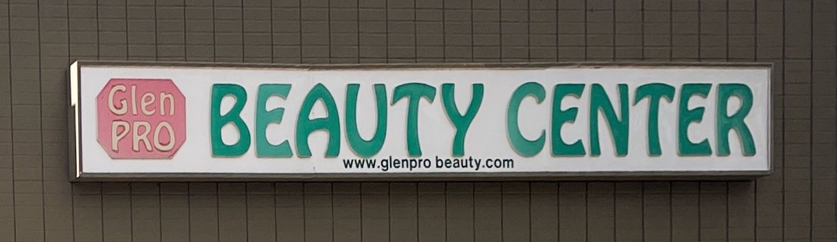
Photo of the existing store sign.
Brand values to visual brand values
When I asked the stakeholder what words he would use to describe his store’s brand, he listed: hometown, trustworthiness, honesty, service, selection, and ministry. I translated the owner’s brand values into two visual brand values:
Honest (clean, nothing hidden or deceiving)
Warm (friendly, helpful)
Combining the logo inspiration
Examples of retro fonts and text on circle paths.
As I was looking for branding inspiration using the visual brand values, I was drawn to two elements: retro-looking fonts (like the font in the existing sign), and text on circle paths. These elements led to the design of the brand logo.
Glen Pro Beauty Center responsive logo designs.
The struggles with implementing color
Color palette
I used the colors in the existing sign as a starting point and looked for inspiration that incorporated coral and teal tones. However, the greyscale mid-fi wireframe looked seemingly fine without any colors. So when I tried to implement colors into the wireframe, it didn’t feel like an improvement.
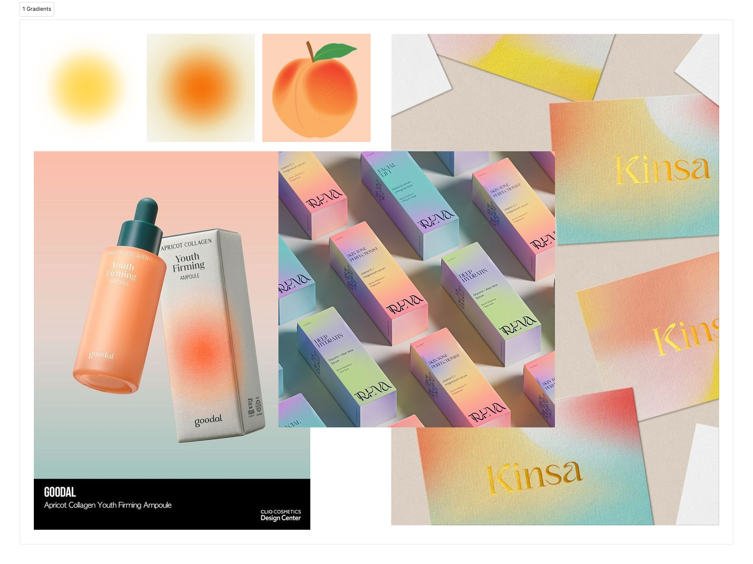
Gradients
My original color inspiration had gradients, but I couldn’t figure out how to use them. I think the issue was that the gradients were pretty, but they were not good for accessibility.
The opposite of gradients
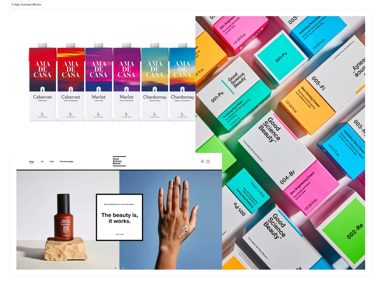
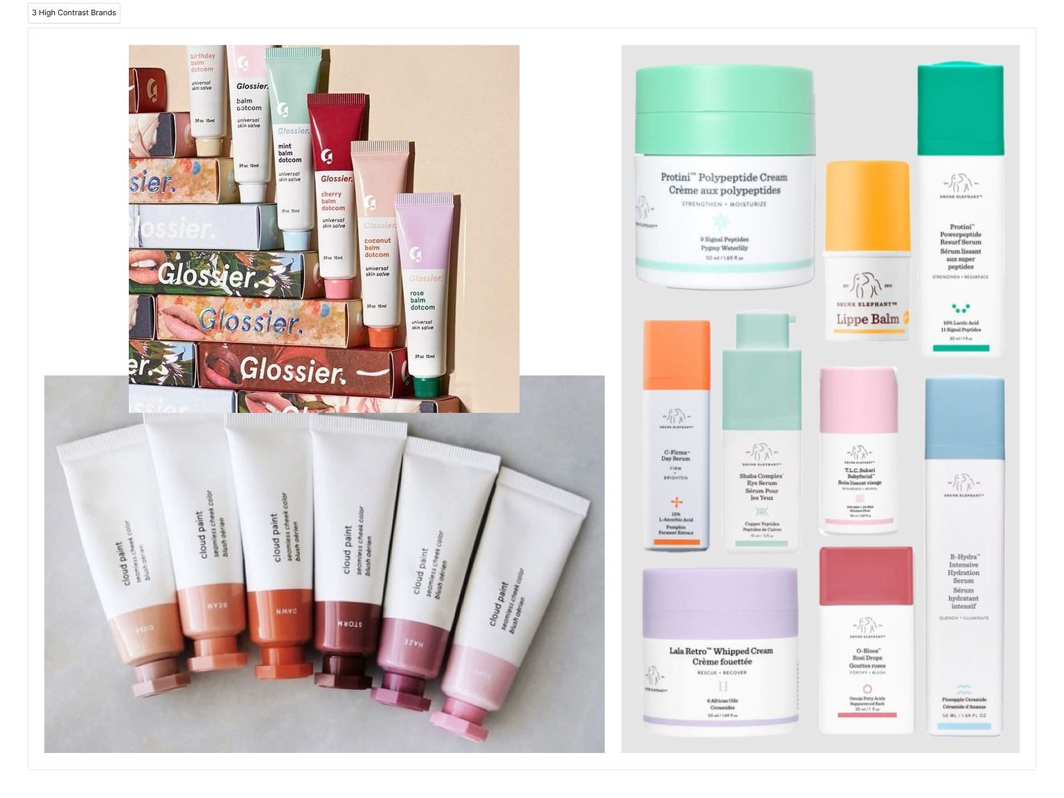
I explored the idea of hard contrast black and white text blocks on top of colorful surfaces. I like how clean this looked and how the text popped. I found two beauty brands that used a similar white text block on a color block for their packaging: Glossier and Drunk Elephant.
Colorful delight
Drunk Elephant’s website was delicious. It had vibrant colors with easy-to-read copy and great use of white space. One thing on Drunk Elephant’s website that caught my eye was their colorful hover states. I loved how the product lists showed white backgrounds for the products, giving a minimal appearance, but hovering over the product cards gave a flash of color. I mimicked this effect in the final design for Glen Pro Beauty Center.

Animation of the product cards’ colorful hover states.
Helping Glen Pro Beauty Center shoppers find what they need online
DELIVER
How does the Glen Pro Beauty Center website address user needs?
The problem: People who shop for beauty products online need help narrowing down product options to avoid choice paralysis, and they want confirmation that certain products will be effective for their skin/hair goals.
The solution: A website with tools to help users feel confident in their product selections through search filters, reviews, Q+A, detailed product descriptions including how-to’s, and a hair quiz that gives users recommendations and tips based on their hair type and concerns.


View the hi-fi prototypes
A mobile phone showing a hi-fi mockup of a portion of the hair quiz and a laptop showing a hi-fi mockup of the home screen.
Where do we go from here?
Next steps for Glen Pro Beauty Center
The future of Glen Pro Beauty Center’s website lies in the owner’s hands. His original plan was to build the website on his own via Shopify due to his limited budget. I hope he will be able to put together the website based on my suggested design choices and launch the website to help improve sales for his business soon.
What I learned
Real products, real feasibility concerns. Ideating solutions for the website was challenging because I had to consider the constraints of the stakeholder’s reality: no budget for web development.
If it doesn’t feel right, it probably isn’t. My initial solution ideas and color palettes didn’t feel right. I tried to push forward with them despite the uncertainty and they led me to dead ends. If something doesn’t feel like it’s working, it can be helpful to step away and come back with a fresh perspective.

NEXT PROJECT

End to end app + branding