


A website where math teachers can customize how they individually support their students to learn math.
Project type: End-to-end responsive website + branding
Role: Sole UX/UI designer + brand designer (with support from my mentor, Ayelén Malaquín, and design critique facilitator, Robbin Arcega)
Industry: Ed Tech, STEM Education
Tools: Figma, FigJam, Optimal Workshop, Zoom, Notion
Duration: Q4 2022
Going back to my teaching roots
DISCOVER
The problem
High school math teachers have up to 175 students to support on a daily basis. Supporting each student individually is very challenging.
Despite the increase in online resource use due to distance learning during the pandemic, high school math teachers struggle to find online resources that help students rather than hinder students from understanding and applying math skills.

As a former math teacher, I wanted to address the needs of my previous colleagues. While my familiarity with the industry gave me an advantage when it came to content knowledge, I had to keep my biases in check when it came to user insights.
My experience as a math teacher does not equal the experiences of all math teachers.
How is the problem currently being addressed?
How are our competitors supporting or hindering students’ learning?
I compared the features, strengths, and weaknesses of 4 online math resources: Khan Academy, Desmos, IXL, and i-Ready. This helped prepare me for the user interviews by giving me a better frame of reference for the types of resources our users currently had available. Also, identifying competitors' common strengths and weaknesses helped me identify elements to mimic or avoid in developing our product.
Competitive analysis showing common strengths and weaknesses. View full analysis.
How are teachers and students addressing the need for individualized support?
I interviewed 4 high school math teachers* between 27-45 years old with 4-20 years of teaching experience. I also interviewed 4 high school students in the 11th-12th grade who had varying levels of math confidence.
*I eventually interviewed 2 more teachers, see the following section to learn why.
Expected outcomes
How do the teachers support students’ understanding of math concepts?
What motivates teachers/students to seek online resources?
What do our users hope to achieve by using online resources?
What prevents our users from achieving those goals?
Focusing on the WHY, not the WHAT
Analyzing the user interviews
Portion of initial affinity map grouping notes based on WHAT users did.

Portion of second affinity map grouping notes based on WHY users did what they did.
Teachers: the primary users
Inconclusive first attempt
In my first round of affinity mapping, I struggled to identify any meaningful insights because I was grouping notes based on what users did. With feedback from my peers, I was reminded to look beyond what users were doing and to focus on why they did what they did.
If we want to launch a new product in schools and classrooms, we need to make sure that our product meets the needs of the teachers first. If we meet the teachers’ needs, then they will use our product with their students. If we don’t meet teachers’ needs, our product will not reach any students.
Identifying user insights
I felt compelled to interview more teachers, so I interviewed 2 more teachers before reevaluating the user interview notes. I re-did the affinity map and this time around, the patterns emerged naturally and I was able to identify 3 overarching insights.
Allowed me to find universal needs rather than addressing wants that only affected a portion of the research participants.
Despite narrowing the user base, hearing from students also helped broaden my perspective by viewing the problem from 2 angles.
What do teachers want, and why?
DEFINE
Insights to HMWs

INSIGHT
Teachers want to train students’ conceptual understanding and critical thinking skills because rote practice only trains procedural skills.
How might we help math teachers train students’ conceptual understanding and critical thinking skills?

INSIGHT
Teachers want students to get immediate feedback that promotes perseverance in problem solving because simply telling a student their answer is wrong doesn’t encourage the student to understand why their answer is wrong.
How might we help math teachers give students immediate feedback in a way that encourages students to persevere in problem solving?

INSIGHT
Teachers want students to be able to start on tasks independently because if they are unable to start on the task, they won’t be able to engage in learning.
How might we help math teachers help students to start on tasks independently to better engage in learning?
Brainstorming solution ideas with constraints
Using the HMWs, I started brainstorming solution ideas, but I found that my previous experience as a math teacher limited the solution ideas I came up with. So I used two idea-generation methods to help me think outside the box.
Playing with opposites: I brainstormed the worst possible solutions. What would be the opposite of a solution? I flipped the bad ideas into their opposites for possible good ideas.
Creative constraints: I used a list of constraints that required me to come up with ideas that worked in various scenarios such as involving a community partner and feeling like a game.
Portion of the solution brainstorm. View brainstorm on FigJam.

Initial solution idea
AI software that would allow students to upload handwritten photos of their math work and ask students questions from a list of teacher-curated questions based on common mistakes and misconceptions.

Aligning the solution to the research
Target the solution to the problem
I shared my solution idea at a design critique and my peers reminded me to use the research insights to make all decisions on what stays and what goes. The AI feature did not directly address any HMW questions, so I continued to develop the idea without the AI.
Revised solution idea
AI software that would allow students to upload handwritten photos of their math work and ask students questions from a list of teacher-curated questions based on common mistakes and misconceptions.
HMWs to Product Goals
How might we help math teachers train students’ conceptual understanding and critical thinking skills?
GOAL
Train students’ conceptual understanding and critical thinking skills.
How might we help math teachers give students immediate feedback in a way that encourages students to persevere in problem solving?
GOAL
Give students immediate feedback in a way that encourages students to persevere in problem solving.
How might we help math teachers help students to start on tasks independently to better engage in learning?
GOAL
Help students to start on tasks independently to better engage in learning.
Revisiting the research
Rephrasing the HMW questions as product goals focused my attention on a more solution-oriented mindset. I went back to the user interviews and competitive research with the following questions in mind:
What do teachers currently do to address these product goals?
What do our competitors do to address these product goals?
How can we improve on what already exists?
How can we create a product to better address these goals?
Goals to Features
GOAL
Train students’ conceptual understanding and critical thinking skills.
FEATURE
Practice problems sourced from the highly-rated Illustrative Mathematics OER curriculum.
GOAL
Give students immediate feedback in a way that encourages students to persevere in problem solving.
FEATURE
Predicted responses + feedback to give students immediate feedback from their teacher for predicted incorrect responses.
GOAL
Help students to start on tasks independently to better engage in learning.
FEATURE
Hints written by teachers to help students start on problems without giving away an answer or solution strategy.
Uncovering user’s mental models
DEVELOP
How do we organize the information on our website?
I wanted to better understand our user’s mental model to inform how the product's information architecture should be. I want the users to be able to find the information they are looking for where they think the information should be.
Card sorting
I conducted a remote closed cart sort via OptimalSort with 5 categories and 35 topics.
5 research participants from our target user group: 4 teachers, 1 math coordinator
Although we only had 5 participants, I was able to identify topics and categories with the most and least agreement.
Ambiguity of words
The card sort results highlighted the need for clearer labels and word choices for the categories and topics. This marked the beginning of ongoing iterations for the UX copy throughout the development process.
What is the difference between tasks, assignments, and problems?
Who is the message board for?
What is the About topic about?
Card sort results highlighting the categories and topics with the most and least agreement.
Getting to the goal with fewer clicks
Pruning the sitemap
Round 1: MVP mindset
The initial iterations of the sitemap focused on eliminating features and pages that were not necessary for the product to meet the product goals.
Round 2: Fewer clicks to product goals
Latter rounds focused on minimizing the number of clicks the user would have to make to reach the key features. For instance, reaching the Create Assignment page with the third sitemap iteration required 4 clicks, but by the seventh iteration, only required 1 click.

Flows for usability testing
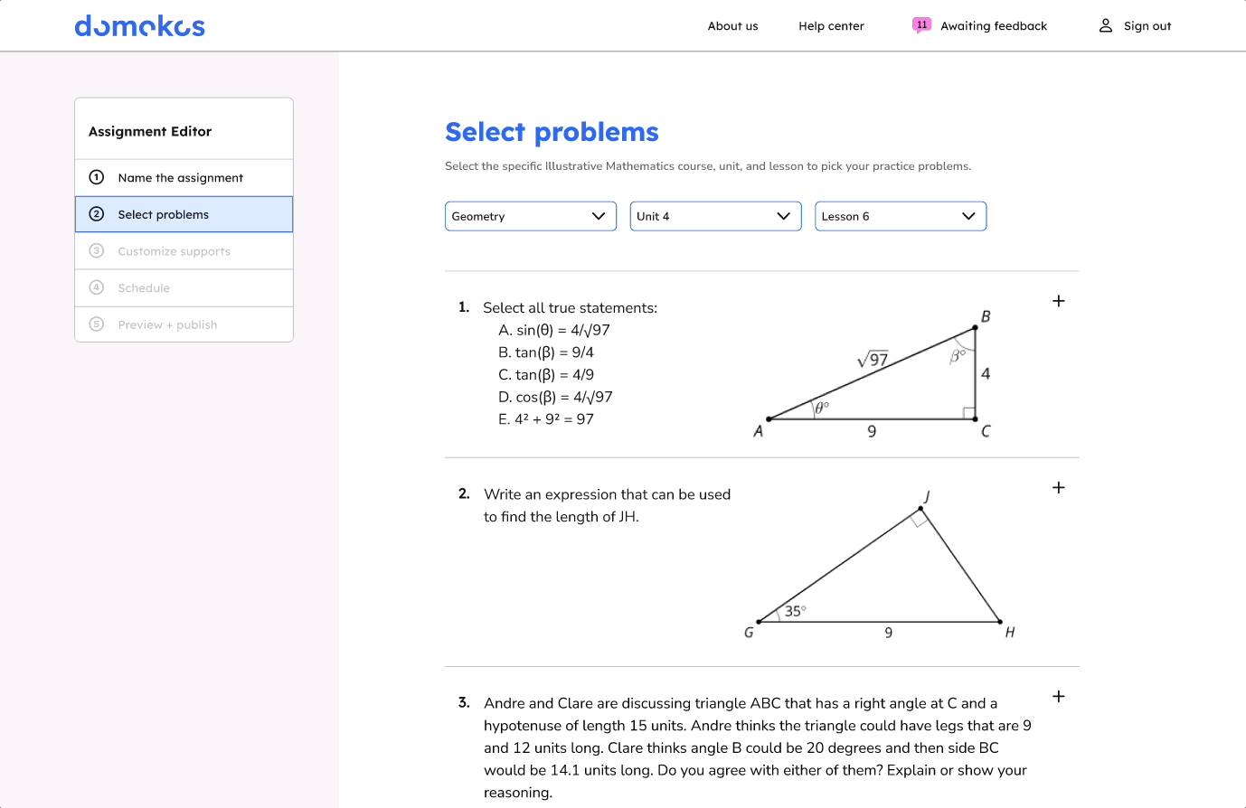
Create an assignment
Select problems
Add guiding questions (hints)
Add predicted responses and feedback
Schedule the assignment
Review unpredicted responses
A single flow with multiple pathways
The Create an Assignment flow included 4 subtasks making it a rather complex flow. I worked out the task flows and user flows with the following questions in mind:
What would the users be looking at?
Where are all of the user’s decision points?
What are the alternate paths or error paths?
Are all alternate paths necessary? Are some alternate paths unavoidable?
How can we help users avoid or recover from error paths?

A comparison of the matching portion of the Assignment Creation task flow and user flow. View all flows in FigJam.
How would the product work?
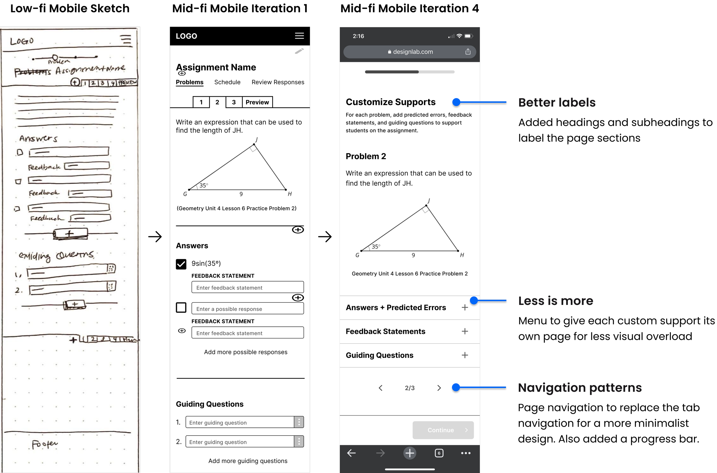
Mobile-first wireframing
Although our users will most likely engage with the product from a desktop or laptop, I wanted to make sure that all of the product features would work on the smallest screen.
In the initial iterations, I focused on minimizing visual overload and fine-tuning the visual hierarchy. I also added support copy through headings and subheads. After adapting the screens for desktop, I worked on incorporating the brand styling through typography, colors, and illustrations.


Branding: It all began with a tortoise
Developing the brand concept
Tortoise and the hare
Slow and steady wins the race.
Our product encourages students to slow down, revise, and resubmit to make sure they are actually understanding.
Tortoise and math
I tried to find a connection between tortoises and math.
I learned that all tortoises are able to flip themselves over. Some are able to do it with their limbs and a select few are able to do it because of the unique shape of their shell.
The Gömböc
These select tortoises’ shells resemble a gömböc, which is a shape discovered in 2006 by Hungarian scientists Gábor Domokos and Péter Várkonyi.
No matter how much a gömböc is tipped over, it will always return to equilibrium. In the same way, our users’ students may take time, but they will find their way to a solution.
The brand was named after Gábor Domokos!
A visual language for the brand style
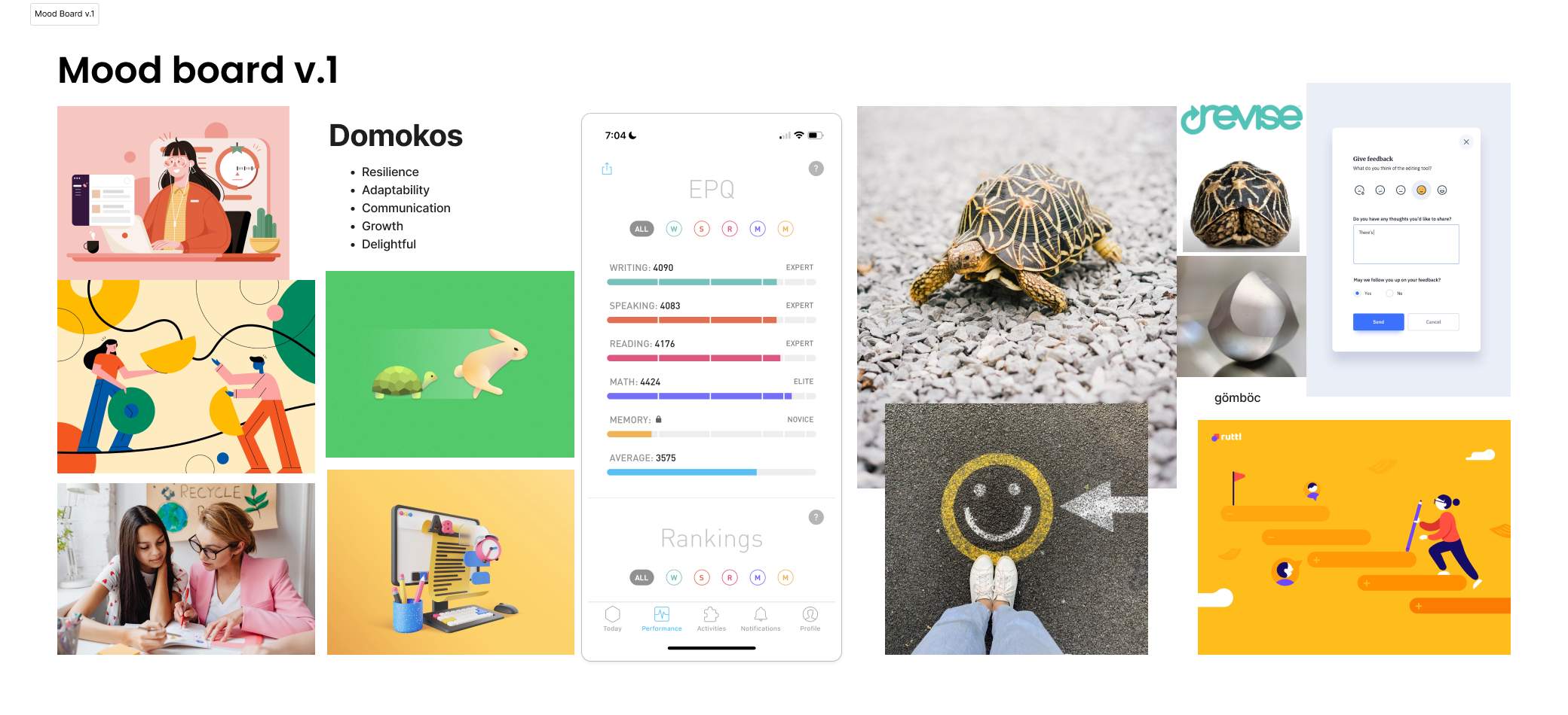
My initial attempt to build a brand mood board was disjointed and random. This was because the brand values that I selected were more experience principles rather than a visual language.
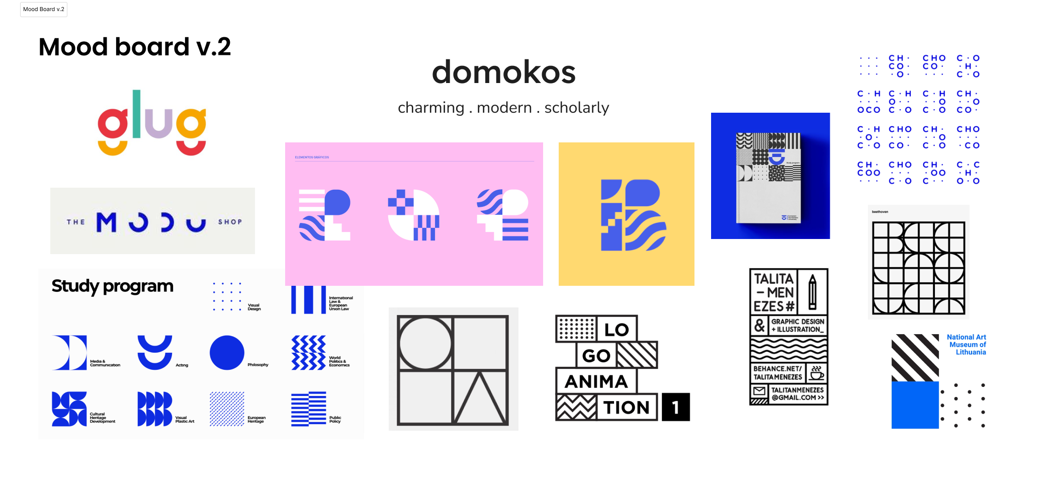
The second iteration brought about a more consistent visual language and repeatable visual elements, such as geometric shapes with solid lines and fills.
I mimicked the colors and typography from the mood board to determine the brand color palette and typography. I found an illustration set by Pablo Stanley that shared the line art style from the mood board while incorporating characters in motion.
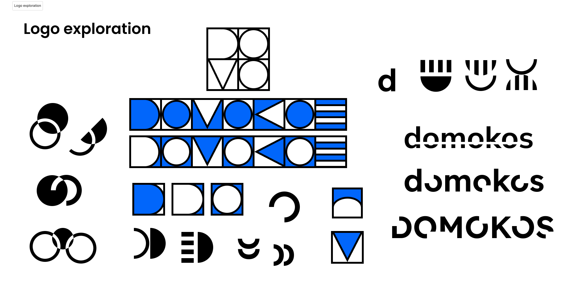
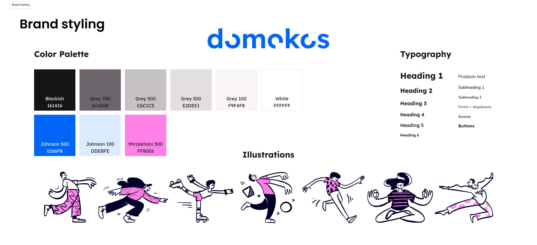
From literal to conceptual
Initial ideas for the logo were directly related to the tortoise concept. After iterating on the mood board, I decided to pursue less literal connections to the tortoise. I experimented with half circles, negative space, and rotating movement. Eventually, I chose to go with a wordmark with cutouts to represent the movement of a gömböc as it returns to equilibrium.

Iterating based on usability test results
Testing the prototype
Conducted moderated usability tests with 5 participants via Zoom. Two participants were from the target user group.
Preview of the desktop prototype used for usability testing.


Hiccups hidden in success
4/5 users were able to complete all tasks without support.
Sounds great right? WRONG!
When I reviewed the usability testing recordings to make note of every click and whether or not it was a correct choice, I found that users often clicked on multiple wrong options before making their way to the happy path.
What were the users clicking instead?
What made the correct options less desirable or confusing?
Prioritizing changes based on frequency and impact
I grouped the usability test notes from each scenario to identify patterns across participants. I sorted the notes based on evidence of what worked, what needed improvement, questions, and ideas. Then, I mapped out the issue and question patterns based on their frequency, impact on product goals, and estimated effort required to resolve the issues.
Frequency to severity map of the issues and question patterns from the usability test results. View usability test results, affinity map, and analysis via FigJam.
Realizing a flow had a strict sequence
The issues that had the biggest impact on the product goals revolved around the predicted responses and feedback screens. It was then that I realized the flow had a strict sequence that users had to follow for the product to work.
Users needed to add the predicted responses before adding their corresponding feedback statements. However, in usability testing, 4/5 users wanted to add feedback statements before adding predicted responses.
How could I revise the screens and flow to help the users be successful on their first try?
I combined the two screens into one screen to force users to add predicted responses and feedback in one step. I also revised the label and description copy based on user feedback.


Support teachers support students with Domokos
DELIVER
How does Domokos address user needs?
The problem: High school math teachers struggle to find online resources that help students rather than hinder students from understanding and applying math skills.
The solution: A website where high school math teachers can train students’ understanding by assigning challenging problems while providing individualized support through feedback for predicted responses and hints.


View the hi-fi prototypes


Laptop showing a hi-fi prototype of the home screen and a mobile phone showing a hi-fi prototype of the review responses screen.
Where do we go from here?
Next steps for Domokos
Free response questions
The most complex question type is free response because our predicted response system will not work as is. I brainstormed a possible way for teachers to give students feedback for free response questions that mimicked Google Docs’ comments when low-fi wireframing but I wasn’t able to finish the design.
Student-facing interface
In order for Domokos to be usable, we also need to build out the student-facing screens.
How would the student homepage differ from the teachers?
What would the assignments look like from the student’s point of view?
What I learned
I have more assumptions and biases than I thought. I must rely on the evidence in the research to reach meaningful insights.
Users determine how specific the problem is. And a more specific problem can make it easier to brainstorm broader solution ideas.
Copy can significantly impact understanding. Everything from one-word button labels to multi-sentence subheadings impact the user’s experience with a product.
