


A website that helps math teachers individually support students develop math skills in a way that encourages critical thinking and perseverance.
Project type: End-to-end responsive website + branding
Role: Sole UX/UI designer + brand designer (with support from my mentor, Ayelén Malaquín, and design critique facilitator, Robbin Arcega)
Industry: Ed Tech, STEM Education
Tools: Figma, FigJam, Optimal Workshop, Zoom, Notion
Duration: Q4 2022
Going back to my teaching roots
DISCOVER
The problem
High school math teachers have up to 175 students to support on a daily basis. Supporting each student individually is very challenging.
Despite the increase in online resource use due to distance learning during the pandemic, high school math teachers struggle to find online resources that help students rather than hinder students from developing math skills.

As a former math teacher, I wanted to address the needs of my previous colleagues. My familiarity with the industry gave me an advantage when it came to content knowledge, but…
my experience as a math teacher does not equal the experiences of all math teachers.
How is the problem currently being addressed?
Teachers + existing online resources
I interviewed 6 high school math teachers regarding the online resources they used or didn’t use, and why. These teachers all had experience teaching pre- and post- pandemic, so they had experience teaching in-person and online.
How are existing resources supporting student learning?


How are existing resources hindering student learning?


What do teachers want, and why?
DEFINE
Insights to HMWs
The user interviews revealed 3 key insights to guide our product direction.

INSIGHT
Teachers want to train students’ conceptual understanding and critical thinking skills because rote practice only trains procedural skills.
How might we help math teachers train students’ conceptual understanding and critical thinking skills?

INSIGHT
Teachers want students to get immediate feedback that promotes perseverance in problem solving because simply telling a student their answer is wrong doesn’t encourage the student to understand why their answer is wrong.
How might we help math teachers give students immediate feedback in a way that encourages students to persevere in problem solving?

INSIGHT
Teachers want students to be able to start on tasks independently because if they are unable to start on the task, they won’t be able to engage in learning.
How might we help math teachers help students to start on tasks independently to better engage in learning?
Calibrating the ideation to the research
HMWs to Product Goals
As I continued to ideate on possible solutions, I rewrote the HMWs as product goals to keep the ideas aligned with the user insights.
How might we help math teachers train students’ conceptual understanding and critical thinking skills?
GOAL
Train students’ conceptual understanding and critical thinking skills.
How might we help math teachers give students immediate feedback in a way that encourages students to persevere in problem solving?
GOAL
Give students immediate feedback in a way that encourages students to persevere in problem solving.
How might we help math teachers help students to start on tasks independently to better engage in learning?
GOAL
Help students to start on tasks independently to better engage in learning.
Breaking down each goal to feature
Product Goals to Features
GOAL
Train students’ conceptual understanding and critical thinking skills.
FEATURE
Practice problems sourced from the highly-rated Illustrative Mathematics OER curriculum.
GOAL
Give students immediate feedback in a way that encourages students to persevere in problem solving.
FEATURE
Predicted responses + feedback to give students immediate feedback from their teacher for predicted incorrect responses.
GOAL
Help students to start on tasks independently to better engage in learning.
FEATURE
Hints written by teachers to help students start on problems without giving away an answer or solution strategy.
How would the product work?


Flows for usability testing
Create an assignment
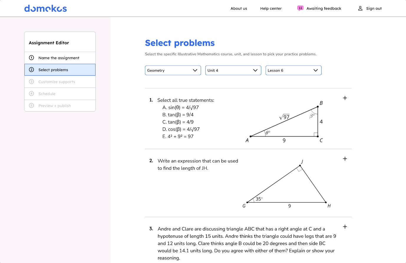
Select problems
Add guiding questions (hints)
Add predicted responses and feedback
Schedule the assignment
Review unpredicted responses
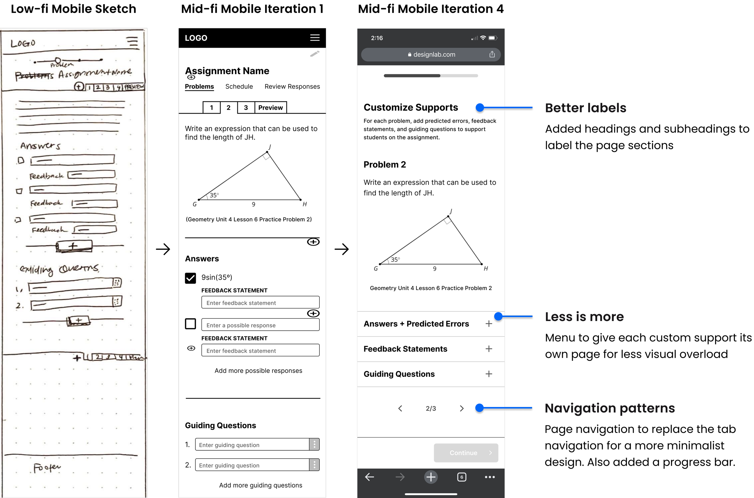
Mobile-first wireframing
Although our users will most likely engage with the product from a desktop or laptop, I wanted to make sure that all of the product features would work on the smallest screen.
In the initial iterations, I focused on minimizing visual overload and fine-tuning the visual hierarchy. I also added support copy through headings and subheads. After adapting the screens for desktop, I worked on incorporating the brand styling through typography, colors, and illustrations.


Iterating based on usability test results
Testing the prototype
Conducted moderated usability tests with 5 participants via Zoom. Two participants were from the target user group.
Preview of the desktop prototype used for usability testing.


Hiccups hidden in success
4/5 users were able to complete all tasks without support.
Sounds great right? WRONG!
When I reviewed the usability testing recordings to make note of every click and whether or not it was a correct choice, I found that users often clicked on multiple wrong options before making their way to the happy path.
What were the users clicking instead?
What made the correct options less desirable or confusing?
Prioritizing changes based on frequency and impact
I grouped the usability test notes from each scenario to identify patterns across participants. I sorted the notes based on evidence of what worked, what needed improvement, questions, and ideas. Then, I mapped out the issue and question patterns based on their frequency, impact on product goals, and estimated effort required to resolve the issues.
Frequency to severity map of the issues and question patterns from the usability test results. View usability test results, affinity map, and analysis via FigJam.
Realizing a flow had a strict sequence
The issues that had the biggest impact on the product goals revolved around the predicted responses and feedback screens. It was then that I realized the flow had a strict sequence that users had to follow for the product to work.
Users needed to add the predicted responses before adding their corresponding feedback statements. However, in usability testing, 4/5 users wanted to add feedback statements before adding predicted responses.
How could I revise the screens and flow to help the users be successful on their first try?
I combined the two screens into one screen to force users to add predicted responses and feedback in one step. I also revised the label and description copy based on user feedback.


Support teachers support students with Domokos
DELIVER
How does Domokos address user needs?
The problem: High school math teachers struggle to find online resources that help students rather than hinder students from understanding and applying math skills.
The solution: A website where high school math teachers can train students’ understanding by assigning challenging problems while providing individualized support through feedback for predicted responses and hints.


View the hi-fi prototypes


Laptop showing a hi-fi prototype of the home screen and a mobile phone showing a hi-fi prototype of the review responses screen.
Where do we go from here?
Next steps for Domokos
Free response questions
The most complex question type is free response because our predicted response system will not work as is. I brainstormed a possible way for teachers to give students feedback for free response questions that mimicked Google Docs’ comments when low-fi wireframing but I wasn’t able to finish the design.
Student-facing interface
In order for Domokos to be usable, we also need to build out the student-facing screens.
How would the student homepage differ from the teachers?
What would the assignments look like from the student’s point of view?
What I learned
I have more assumptions and biases than I thought. I must rely on the evidence in the research to reach meaningful insights.
Users determine how specific the problem is. And a more specific problem can make it easier to brainstorm broader solution ideas.
Copy can significantly impact understanding. Everything from one-word button labels to multi-sentence subheadings impact the user’s experience with a product.
