


a fitness app for older adults
Improving user activation rate by integrating the app with users’ existing exercise routines
Project type: End-to-end app + branding. View the full project case study.
Role: Sole UX/UI designer + brand designer, with support from my mentor, Ayelén Malaquín, and design critique facilitator, Amber KB Wilson
Industry: Health, Fitness
Tools: Figma, FigJam, Zoom, Notion
Duration: Q3 2023
Introduction


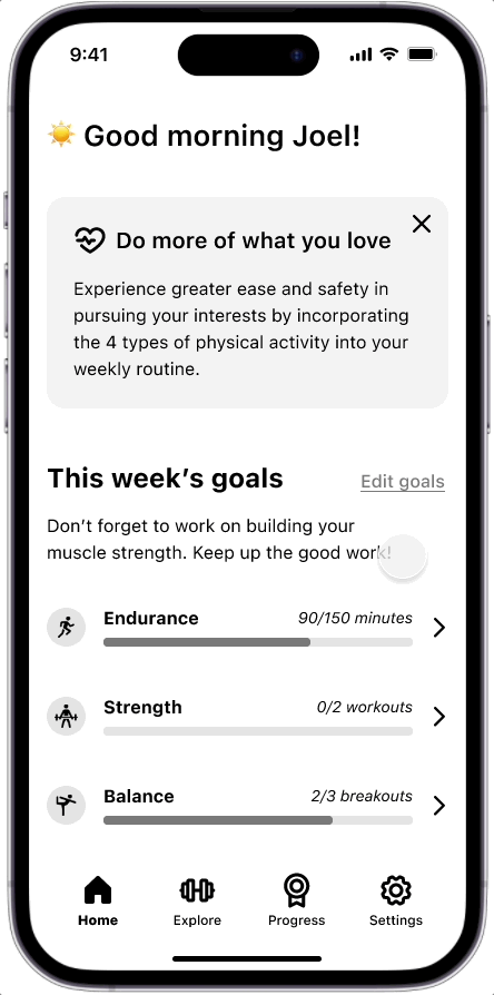
The product
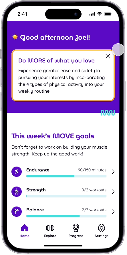
MoveMore is a fitness app for older adults seeking to maintain and improve their mobility by encouraging users to incorporate targeted exercise categories into their weekly routines through reminders and goal tracking.
The US Department of Health and Human Services recommends that older adults keep up a balanced exercise regimen that includes 4 types of exercise: endurance, strength, balance, and flexibility.
The users
Adults between 60-75 years old who are concerned that their deteriorating physical health will impact their ability to live a more full life.

The business goal
We wanted to improve the user activation rate by making MoveMore a part of users’ daily routines.

How might we integrate Move More with users’ daily routines?
Making the most of users’ existing routines
User research found that most users had a habit of going on walks each day as their only form of exercise. While walking on its own is not enough for improving mobility, we wanted to tap into this existing routine. How I might we integrate users’ walks with the MoveMore app?
The proposed solution
Allow users to document any exercise completed outside of the app to earn credit toward their weekly goals. By creating a way for users to incorporate their existing exercise routines in the app, we hope to make the app a regular part of their daily routine.

Multiple access points
I included links to the exercise input form in two places within the home screen.
A card within the main carousel - Did you already exercise today?
A shortcut button - Log Off-App Exercise

Mobile phones showing screens from the mid-fi prototype: Home, Select an exercise type, Add exercise details, and Exercise logged.
An unexpected issue
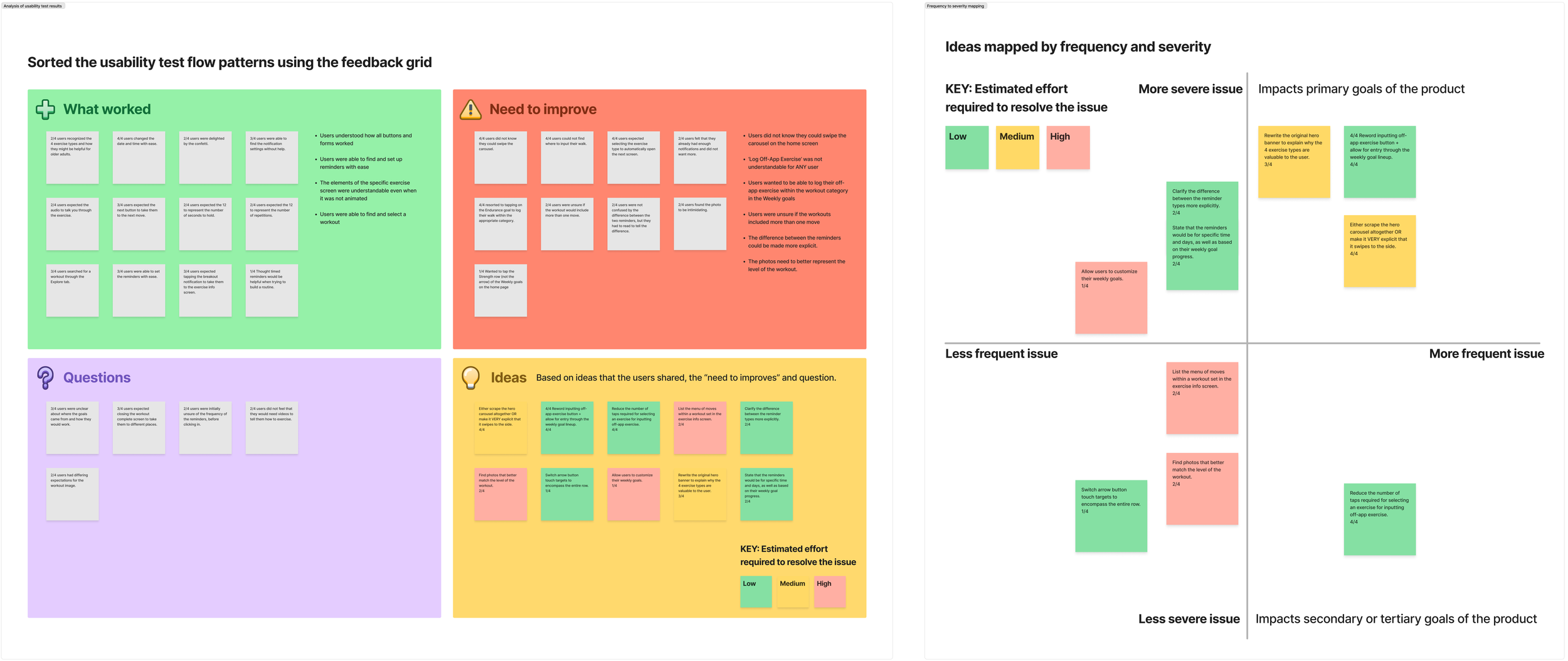


What didn’t work?
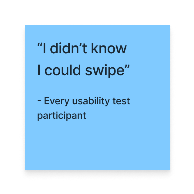
Users couldn’t figure out where to go to input their exercise completed outside of the app.
The button labeled “Log off-app exercise” did not make sense to the users.
The alternate card was hidden within the carousel that users' didn’t know they could swipe to view more of.
Users resorted to tapping the Endurance category within the Weekly Goals, but that led the users to the list of Endurance workouts.
What did work?
Once instructed to horizontally swipe the carousel, users immediately identified where they could go to document their exercise.
Users completed the Input Exercise Form with ease.
Users were delighted by the progress animation shown on the Exercise logged screen.
The users naturally swiped vertically! They didn’t know they could swipe horizontally on the carousel, but they felt safe swiping up and down on every screen.
Helping users FIND the Input Exercise Form
Priority revisions
Since users didn’t have issues with inputing their exercise details in the Input Exercise Form, I focused the solution ideas on making finding the form easier to find.

Idea 1: More visual cues for the carousel
Pro
Adding page indicator dots below the carousel would signal to users that there was more content to be viewed.
Con
This didn’t address the fact that users didn’t make sense of the language in the Log Off-App Exercise button that was taking up prime real estate on the home screen.

Mid-fi home screen showing page indicator dots below the carousel.
Idea 2: Lay out the cards vertically
Pro
The cards allowed space for more conversational copy which the users connected better with. I think the button was confusing for users because I had to figure out a way to say a lot with limited space and ended up using words that were unfamiliar to them.
Also, the users naturally swiped vertically on every screen. So laying out the content vertically would align with users’ swiping habits.
Con
This made a very long vertical scroll which could be an issue for users with possible dexterity issues.

Mid-fi home screen showing the carousel cards laid out vertically.
Idea 3: Bump up the goal tracking
Pro
The visual of the weekly goals and categories made sense to the users. So rather than having the users open the app to a wall of text that they didn’t feel connected to, bringing up the goal tracking would allow users to make an immediate personal connection with the app.
Con
It’s not necessarily a con, but I had to reprioritize the sequence of content for the home screen scroll. If we want to increase user activation, we needed to find the balance between users’ priorities (their goal progress) and our hook (earning credit for exercise completed outside of the app).
Mid-fi home screen showing the goal tracking at the top.
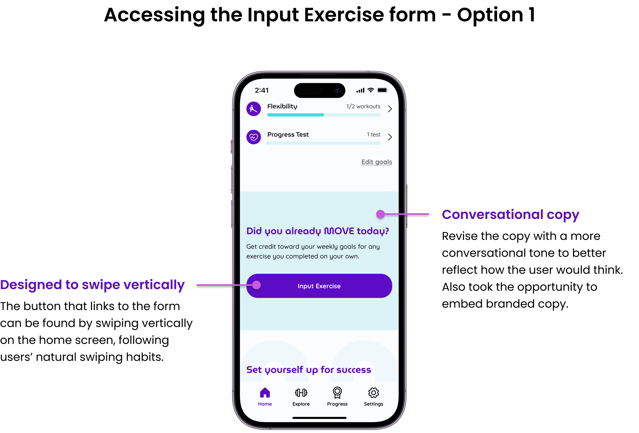
Idea 4: New access point within the exercise categories
Pro
This new access point gives users another place to input their exercise completed outside of the app. During usability testing, users resorted to tapping on the exercise category within the weekly goals when they couldn’t find where to document their exercise. This led users to the list of workouts for that specific exercise category. So that is where I decided to place the new access point.
Con
I tried to make the banner as small as possible without losing the conversational copy that the users preferred. Also, users would be able to close the banner if it was not relevant for their needs.

Mid-fi home screen showing the Already Exercised Today banner above the workouts.
The final solution
Plan: Improve user activation rates by finding opportunities to integrate the MoveMore app with users’ daily routines.
Research: Users had an existing daily walking routine outside of the app.
Solution: Allow users to input any exercise completed outside of the app to earn credit toward their MoveMore weekly goals.


Hi-fi prototype showing the Input Exercise user flow.
Where do we go from here?
Let’s see if the changes worked!

First, I would recommend conducting usability testing again with new participants. Have the changes made it easier for users to find the input exercise form?
If usability testing is not an option, I would recommend tracking the following metrics:
What percentage of users are inputting their off-app exercise? Are those users more engaged with our app overall?
How has the new feature impacted the user activation rate?
Other possible improvements
If the input exercise form is a hit
Are there more more efficient methods for documents off-app exercise? Such as syncing with smart watches and other movement data collected on users’ phones.
Could we implement the existing reminders to help remind users to input their exercise information?
If the input exercise form does not significantly impact the user activation rate, we may have to consider other solution option, such as improving the onboarding process.
What I learned
Communicating design decisions in light of the business goals.
It is much easier and natural for me to explain my decision decisions based on user insights. However, it is equally valuable to consider how those decisions also support the business goals.

READ THE FULL PROJECT CASE STUDY
End-to-end app + branding
NEXT PROJECT

End-to-end responsive website + branding