


A mobile app to help retired adults live life to the fullest by improving their mobility.
Project type: End-to-end app + branding
Role: Sole UX/UI designer + brand designer (with support from my mentor, Ayelén Malaquín, and design critique facilitator, Amber KB Wilson)
Industry: Health, Fitness
Tools: Figma, FigJam, Zoom, Notion
Duration: Q3 2023
Designing an app for retired adults
DISCOVER
Why retired adults?

Based on existing research on older adults + technology:
Older adults are usually not the target demographic for new technologies. However, they are capable and interested in adopting new technologies… and they have money!
In 2020, the pandemic drove many older adults to adopt technology to stay connected with their family and friends.
“By 2030, the 50-plus market is projected to swell to 132 million people who are expected to spend on average $108 billion annually on tech products.” (AARP, 2022)
How do retired adults use their time?

My hypothesis
Retired adults, between 60-75 years old, feel that they always have time available and so they don’t make the most of their time for the things they used to carve out time for when their time was more limited, such as managing responsibilities and pursuing passions.

Getting to know retired adults through user interviews
Interviewed 5 retired adults between the age of 64-76 via Zoom.
Expected outcomes
Understand what users do with their time on a daily basis.
Determine the hindrances that keep users from doing more of what they want to do.
Understand how I can make an app that is more user-friendly for retired adults.
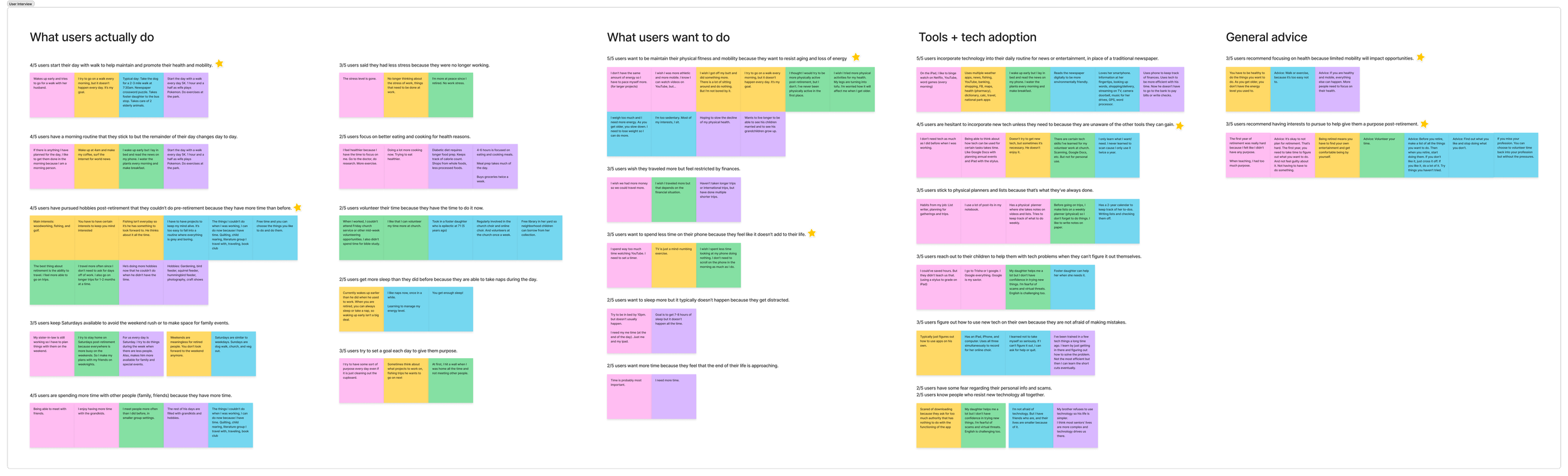
Affinity map of notes from the user interviews. View the affinity map via FigJam.
What do retired adults DO?
4/5 users start their day with a walk to help maintain and promote their health and mobility.
4/5 users have pursued hobbies post-retirement that they couldn’t do pre-retirement because they have more time than before.
What do retired adults WANT?
5/5 users want to better maintain their physical fitness and mobility because they want to resist aging and loss of energy.
3/5 users recommend focusing on health because limited mobility will impact opportunities.
Is there a disconnect between what retired adults want to do with their time and what they actually do?
According to user interviews… time is not the issue.

My hypothesis was wrong!
DEFINE
Defining the problem


Retired adults are pursuing their interests now that they have more free time and less stress. However, they are concerned that their deteriorating health will impact their ability to live a more full life.
Rerouting the research
New research focus: Physical fitness for older adults
Now that the problem space was more defined, there was more research to be done. I approached my second round of research with the following questions in mind:
What factors are recommended for exercise for older adults?
How do apps support those recommended factors?
How do apps help/hinder hesitant users from trying new workouts?
How do apps support users in maintaining their exercise habits?
Research for the content
I needed a reliable resource for physical fitness recommendations for our target users to have confidence that our product would not cause harm. I relied on the Physical Activity Guidelines for Americans created by the U.S. Department of Health and Human Services and recommended by the National Institute on Aging.
According to the Physical Activity Guidelines for Americans:
More movement and less sedentary time is generally better for older adults.
Older adults should have varied types of exercise focusing on endurance, strength, balance, and flexibility for at least 150 minutes each week to help with areas such as fall prevention.
Research for the method - Competitive research
I compared 3 fitness apps, 2 targeted toward older adults and 1 targeted toward sedentary workers. I wanted to see how they currently addressed our target users and how their products helped/hindered users from following the aforementioned physical activity guidelines.
Mighty Health

Workout for Older Adults

Wakeout

Mighty Health and Workouts for Older Adults are mindful of possible health conditions and restrictions of its users.
All three competitors include streak tracking and options to add reminders for workouts to encourage consistency.
How might we help retired adults increase mobility + decrease sedentary time?
Brainstorming solution ideas
Using the HMW question, I brainstormed as many solution ideas as I could. I knew that making an app with limited features would help our new users who will have to learn a new technology and decrease barriers to entry. So I used the problem and research to define product goals to use as guidelines in the elimination process.
Product goals
Decrease sedentary time in users’ existing routines with reminders.
Diversify users’ exercise to include endurance, strength, balance, and flexibility.
Educate users on the reasoning behind the recommended exercise types.

Prioritizing with an MVP mindset
DEVELOP
Where and how will the user achieve the product goals?
Which branches of the sitemap will we need for usability testing?
I laid out the sitemap using our product goals and referencing the language and app organization of our competitors. Before diving into the weeds of the branches of the sitemap, I decided to focus my attention on the pages of the app that would most likely need to be created for usability testing.

Sitemap showing greyed out sections that will likely not be needed for usability testing. View the sitemap via FigJam.
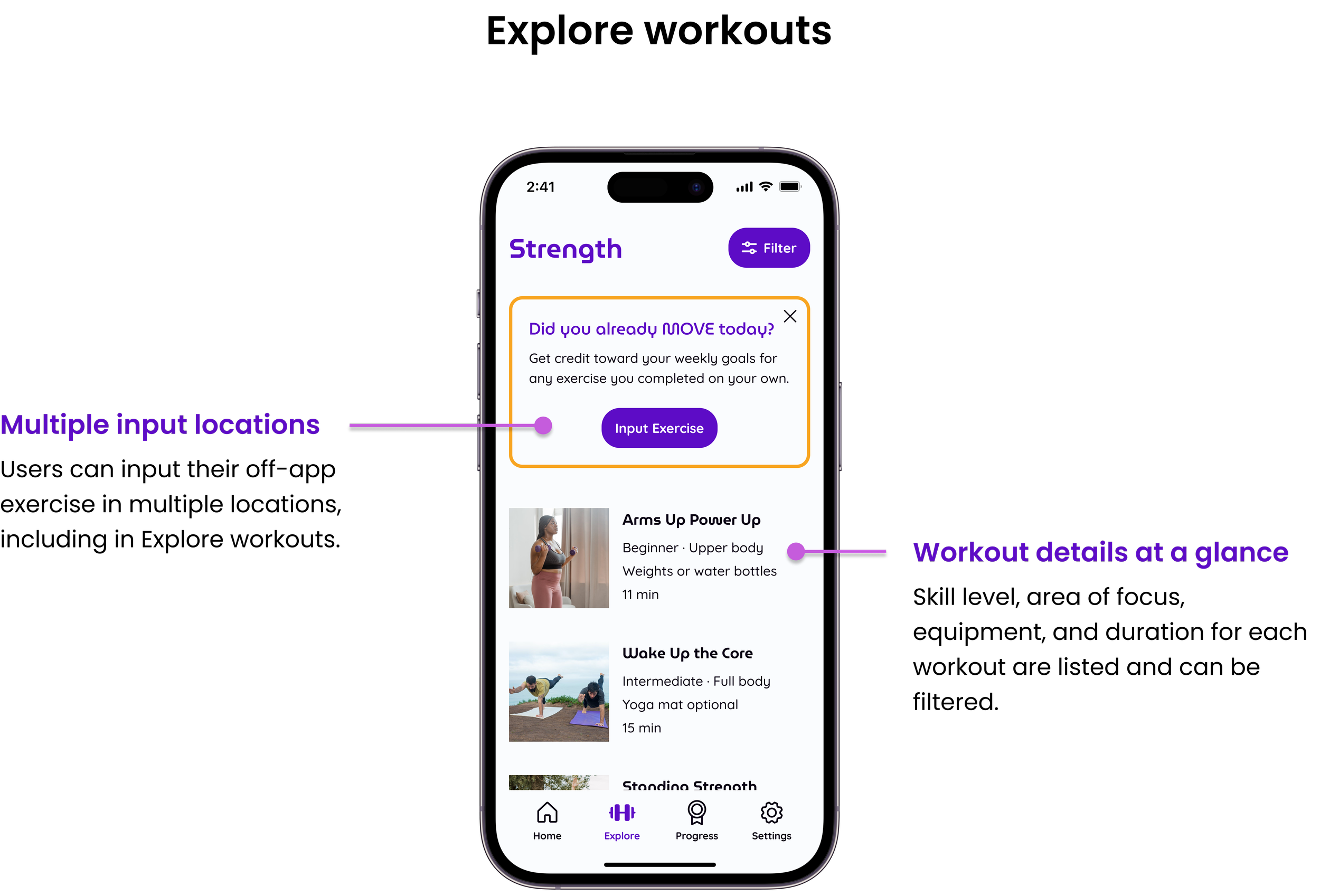
Accounting for users’ existing routines
According to the user interviews, 4/5 users regularly go for a walk each morning. If we want our target users to make our app a part of their routine, we must include a way for users to earn credit for their existing fitness routines. Inputting off-app exercises became the first of the task flows and user flows I developed. I incorporated exercise type, duration, and date to allow progress tracking toward the recommended exercise guidelines for older adults.
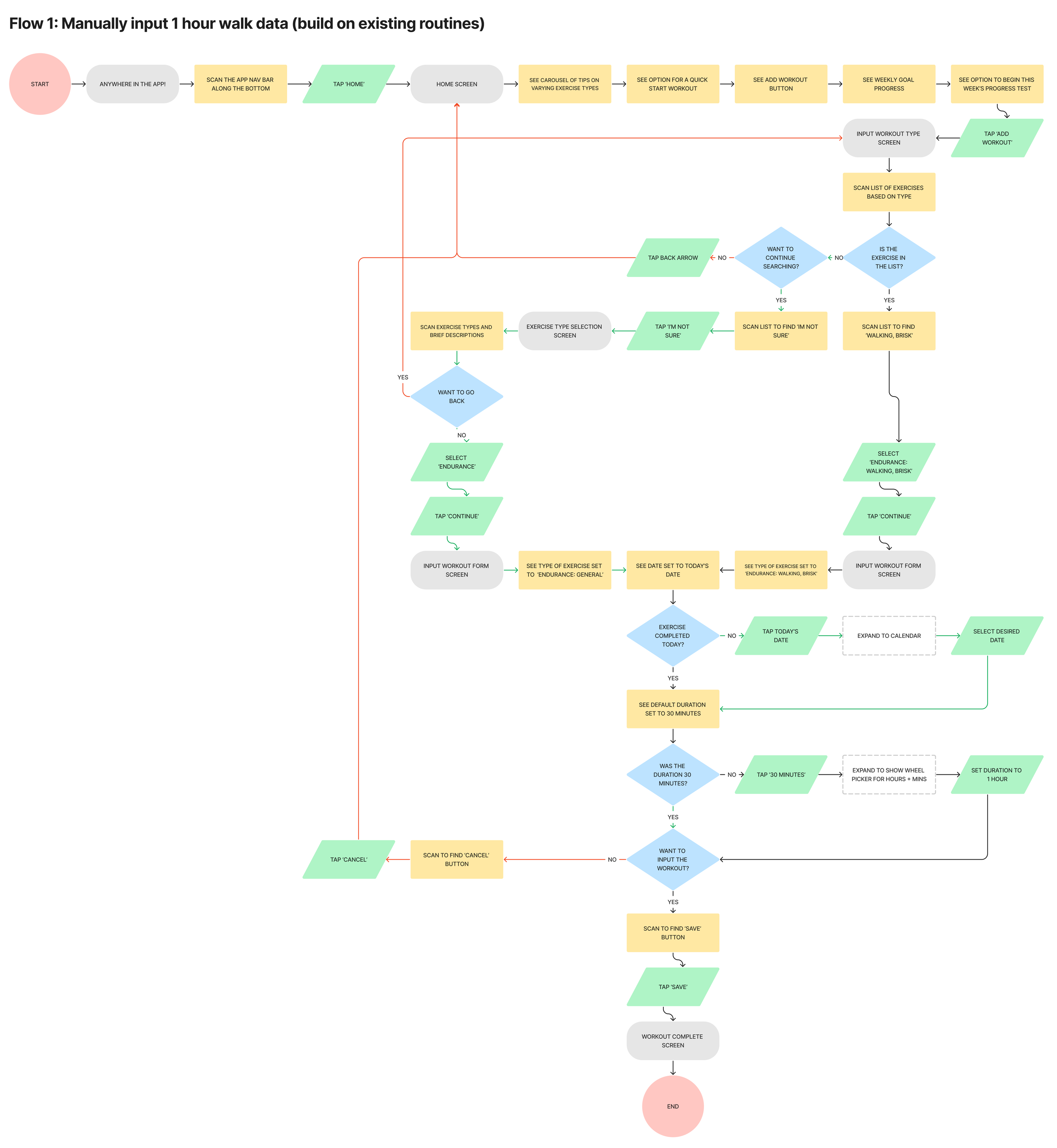
User flow for manually inputting data for a 1 hour walk. View the user flows via FigJam.

Flows for Usability Testing
The following were defined as the primary flows necessary for testing if our product meets our product goals:
Manually input data for a 30-minute walk completed off the app
Set reminders for breakouts and/or workouts
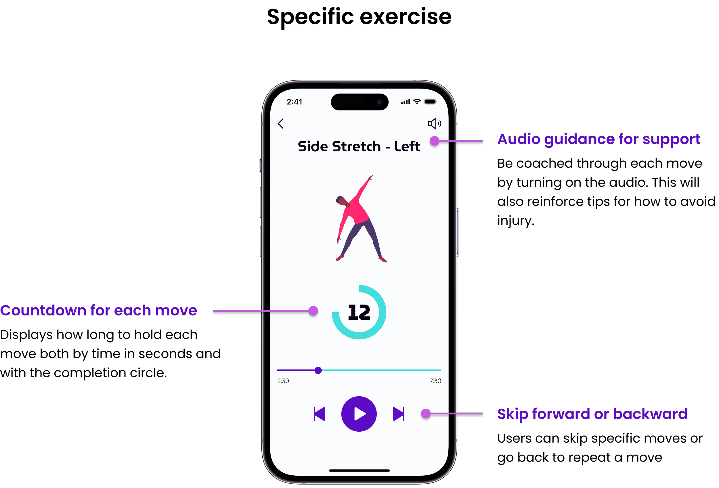
Search and complete a lower-body strengthening workout
Receive a breakout notification and complete the breakout
Finding design patterns for every element
Image content to best support users + product development
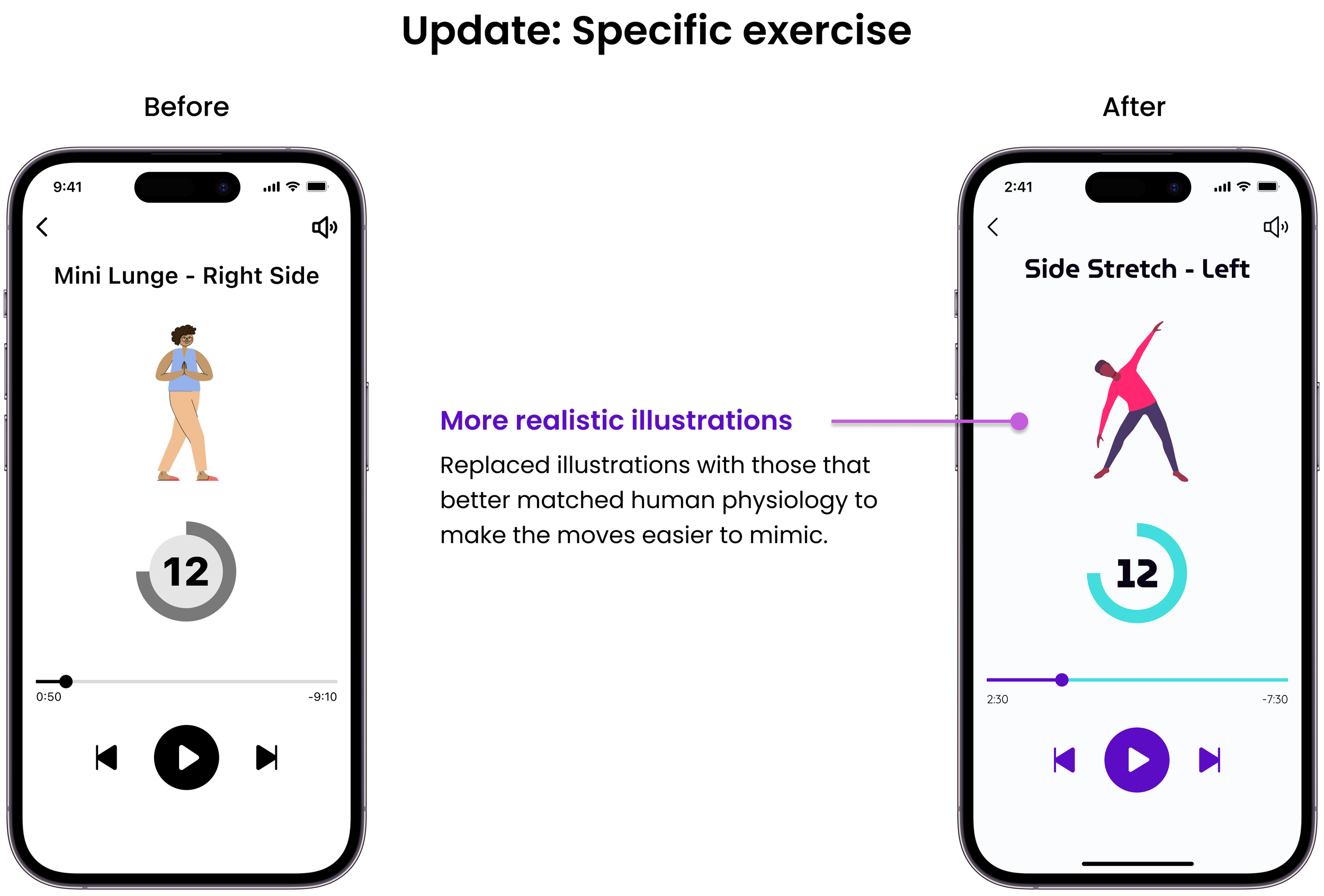
As I worked through the user flow for completing a workout within the app, I had trouble visualizing what the workouts would look like. Initially, I hoped to use the National Institute on Aging’s YouTube videos but they were severely outdated and filmed strangely.
I consulted other designers and they helped me decide to go with still images of animated gifs for the prototype.
Animated gifs will more likely age slower over time.
Human video gifs could be time-consuming to film and make consistent across the app.
We can diversify the appearance of the gif examples with more ease (stature, gender, skin tone).
Presentation slide shared with designers to get feedback on my image dilemma.
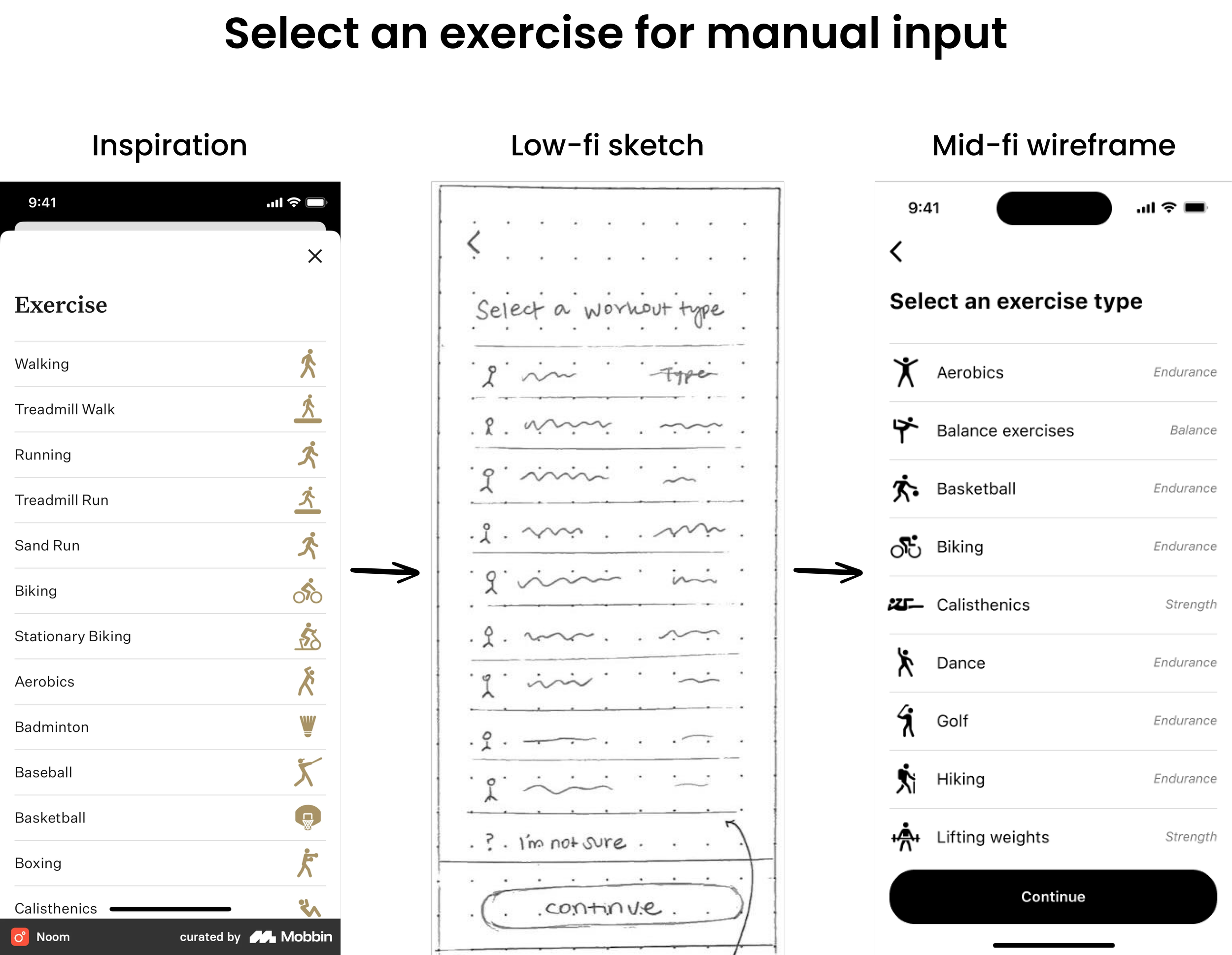
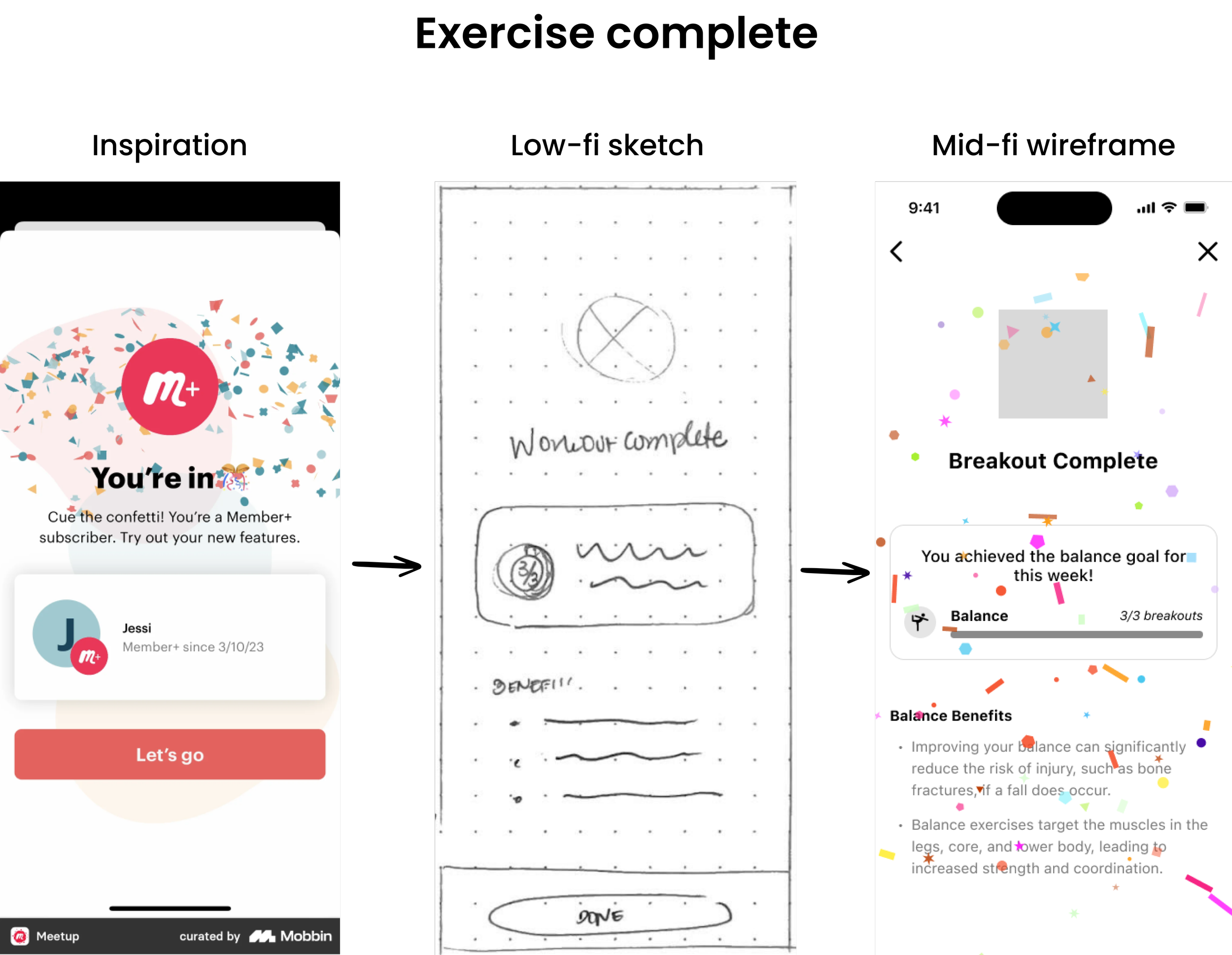
Inspiration to Prototype
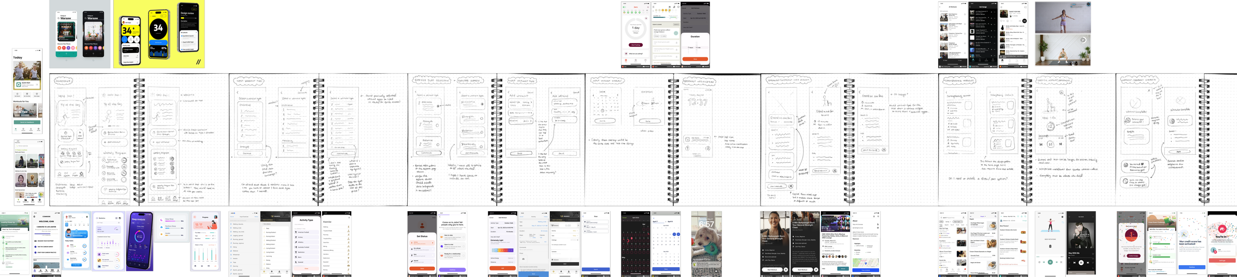
Low-fi sketch wireframe surrounded by reference screenshots of various apps. View low-fi wireframes via Figma.
I used Mobbin to find inspiration for specific pieces on every screen. Using existing design patterns will lessen the amount of new tech learning the user will have to do in order to use the app. More predictable interactions will help the user feel more confidence when trying the app for the first time.
Investing time earlier in the development led to a faster sketch to mid-fi wireframe process. Also, most of the design choices from the sketch wireframes remained through hi-fi iterations.


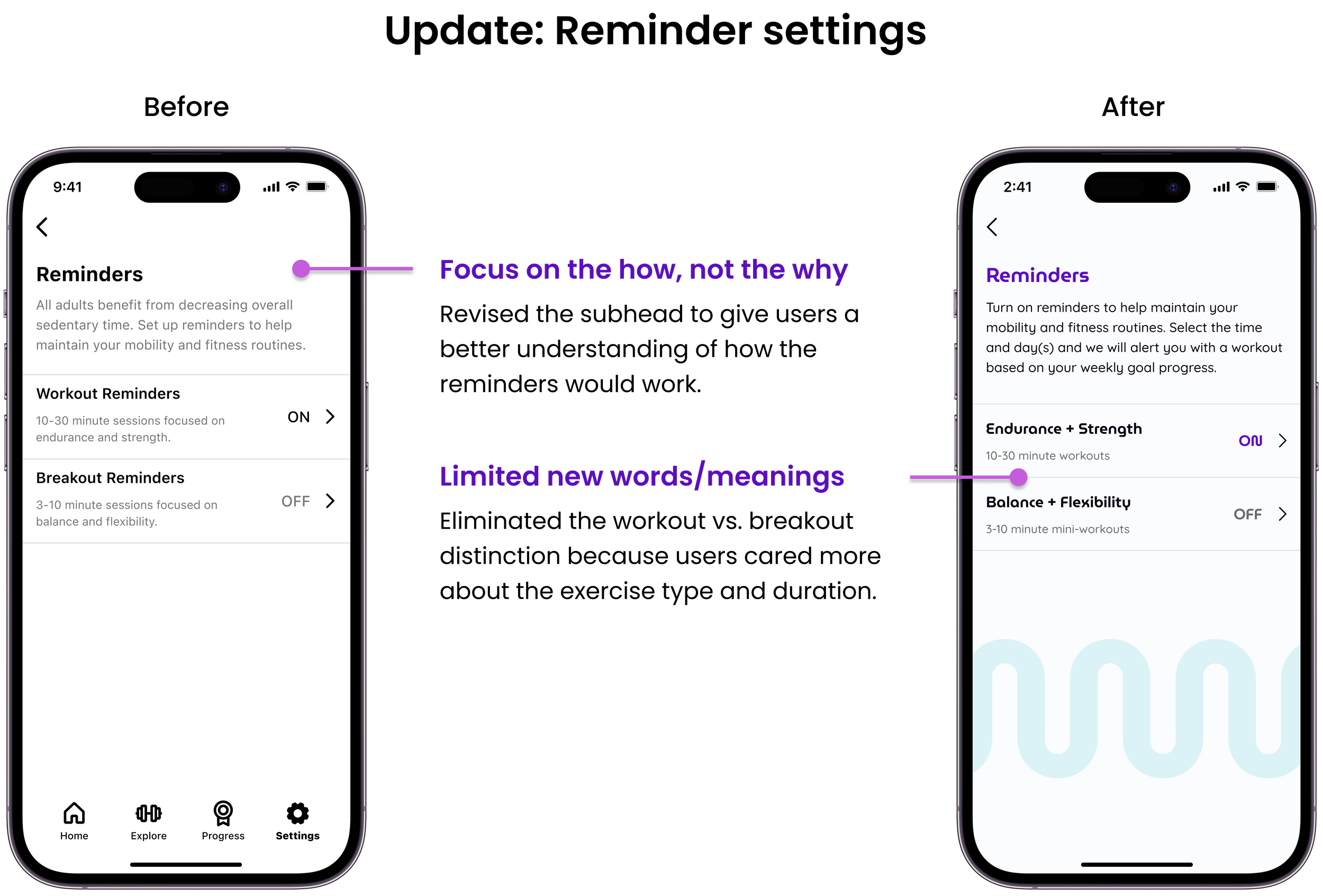
Yellow flag: New meanings
How can I limit the amount of new words or new meanings the user has to learn?
I referenced competitors’ apps and the physical activity guidelines document to identify copy patterns to mimic in our app. However, I wanted a way to distinguish the longer vs. shorter exercise offerings.
Workouts vs. Breakouts: Is the distinction necessary?
I wasn’t sure. I designated ‘workouts’ for longer exercises and ‘breakouts’ for shorter exercises. I marked this as a yellow flag heading into usability testing. I was curious to see how users would make sense of these words.
Testing the prototype
Conducted moderated usability tests of the 4 user flows with 4 retired adults (2 in-person and 2 via Zoom).
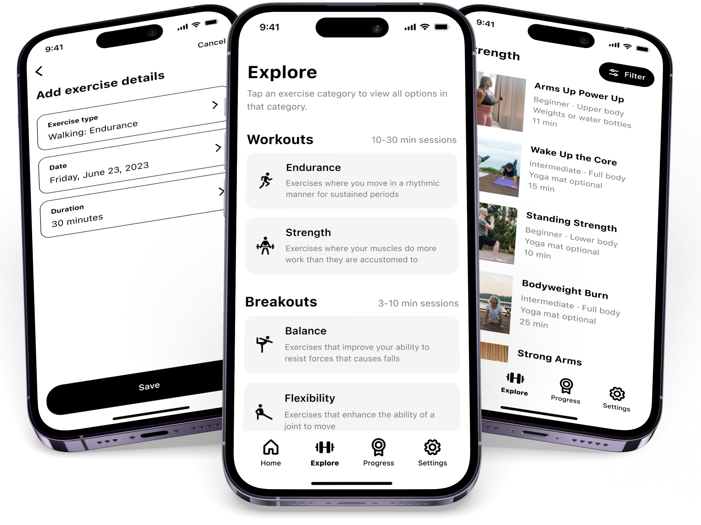
Mobile phones showing screens from the mid-fi prototype: Add exercise details, Explore workouts/breakouts, and Strength workouts.
Branding that is motivating but not intimidating
Just do it. Not like that.
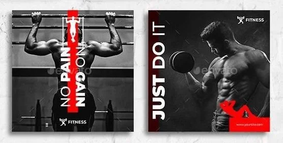
Example of intimidating fitness branding.
I started the brand design process by searching for fitness branding examples. I found that many existing fitness brands gave off a Nike - Just do it vibe. That gave me a clear understanding of what is didn’t want. While that may work for younger audiences, I felt that it could be off-putting for older adults who are already feeling the limitations of their physical bodies.
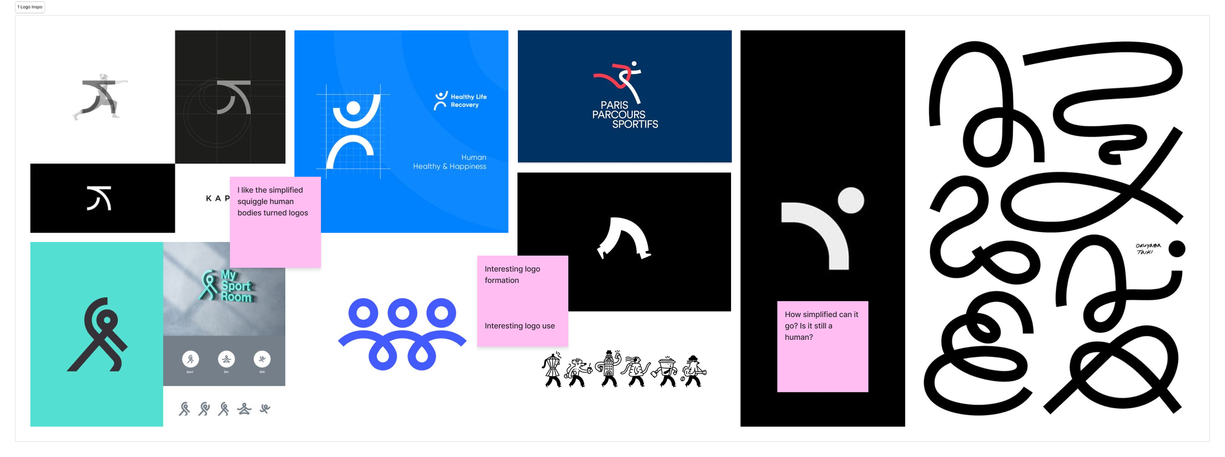
Where the squiggle led
Squiggles in logos. In my search for the opposite of the above example, I found logos made up of squiggles that resembled human bodies. I felt that these logos depicted the human body as flexible and not rigid.
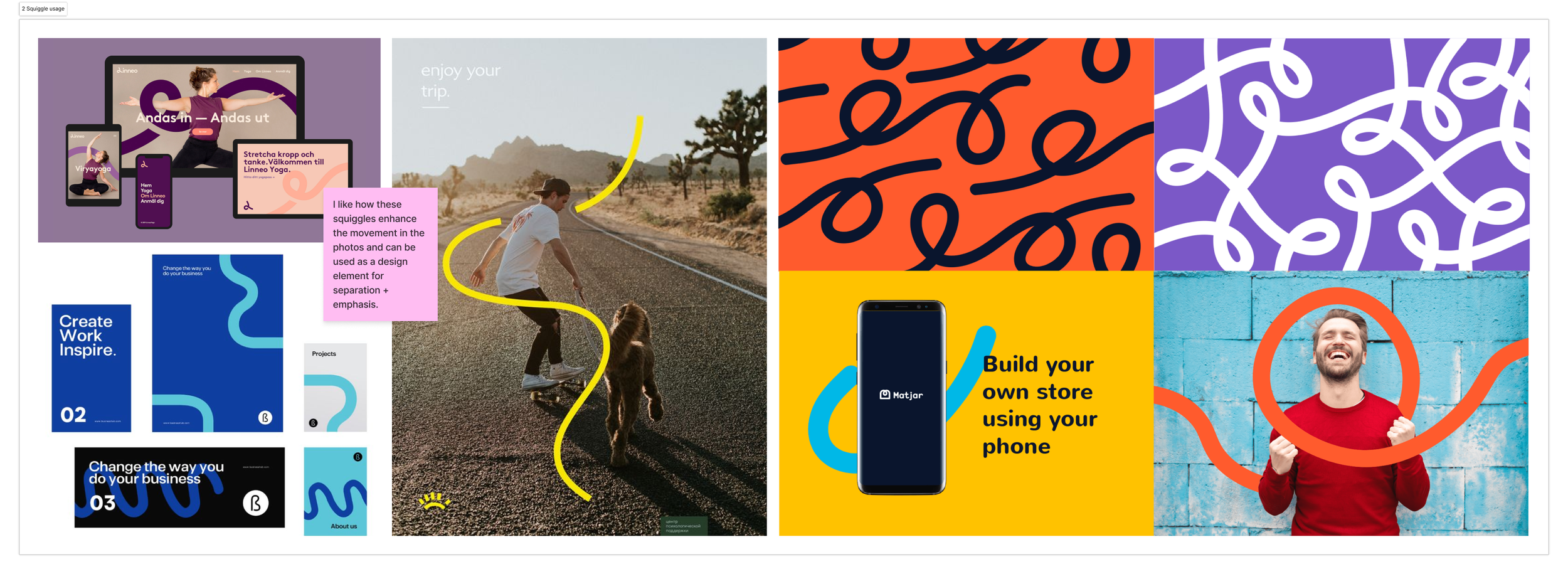
Squiggles with text and images. That led me to find examples of how squiggles could be used with text and images. I liked how the squiggles added movement and emphasis.
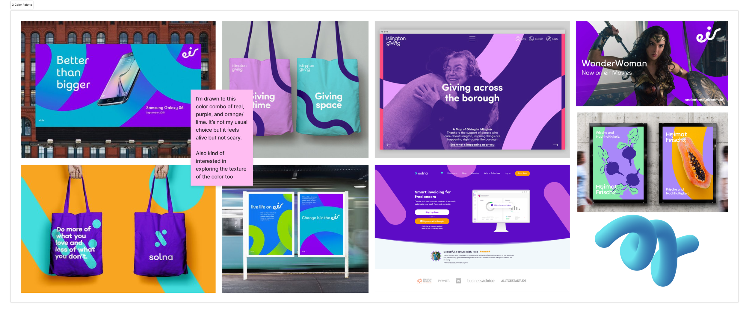
Squiggle color palettes. I was drawn to a few brand images with squiggles in a purple and turquoise color combo. I loved the vibrant and youthful energy. I looked into these brand websites to see how they used the color combo across their website to help me define the color palette for our product’s brand.
Brand name
After juggling fitness-related words, I landed on the brand name Move More. It’s as literal as it gets! Users won’t have to wonder what this app is for when it appears in their search results.
Font

I preference tested san serif fonts with rounded letter forms for readability with 2 people in our target audience. They narrowed down the options to MuseoModerno and Quicksand. MuseoModerno had a squiggly “M” that was a perfect fit for the type of shapes I was drawn to in my inspiration search.
Squiggle
The union of multiple Ms in the MuseoModerno font created the squiggle that was used as a visual element throughout the hi-fis.
Accessibility check
Touch targets
All touch targets are a minimum of 48px by 48px. And I looked for opportunities for touch targets to span the width of the screen.
Color contrast
Every color combination of the brand palette was tested for color contrast to make sure we only used combinations that met WCAG’s AA contrast criteria.
Color-blind safe
The brand color palette was checked for possible color-blind conflicts.
Brand color palette chart.
Font selection
Quicksand was chosen as the body font based on multiple font preference tests from 2 retired adults.
Text sizing
Longer paragraph text sizing is set at or above 14 px and label text is set at or above 12 px bold. Line spacing was set to 150% for easier readability.
Brand typography chart.
Design system showing icons, buttons, and components. View the design system/UI kit via Figma.
Iterating based on usability test results
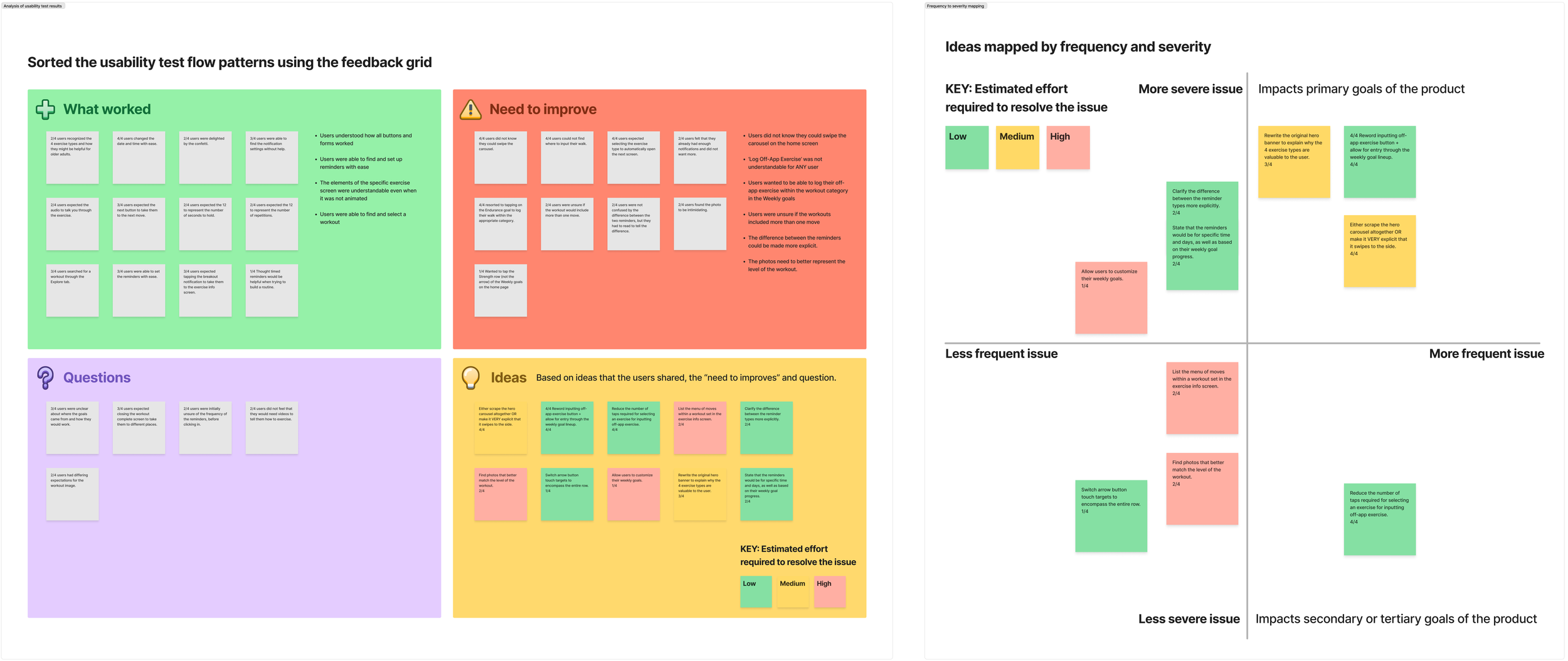


Red flag: Too much above the fold
I chose to use a carousel in the hero section because I thought all 4 tasks that I wanted the user to do were important:
Understand the need for all 4 exercise types
Input off-app exercise
Set reminders
Quick start workouts
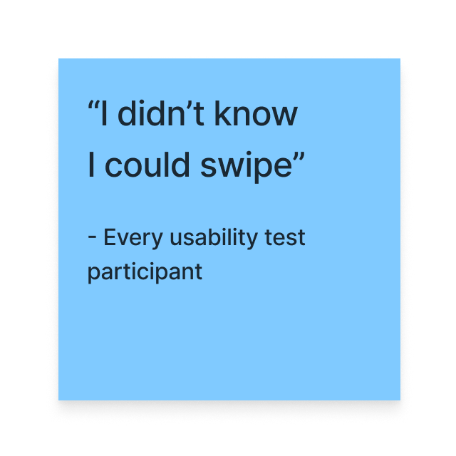
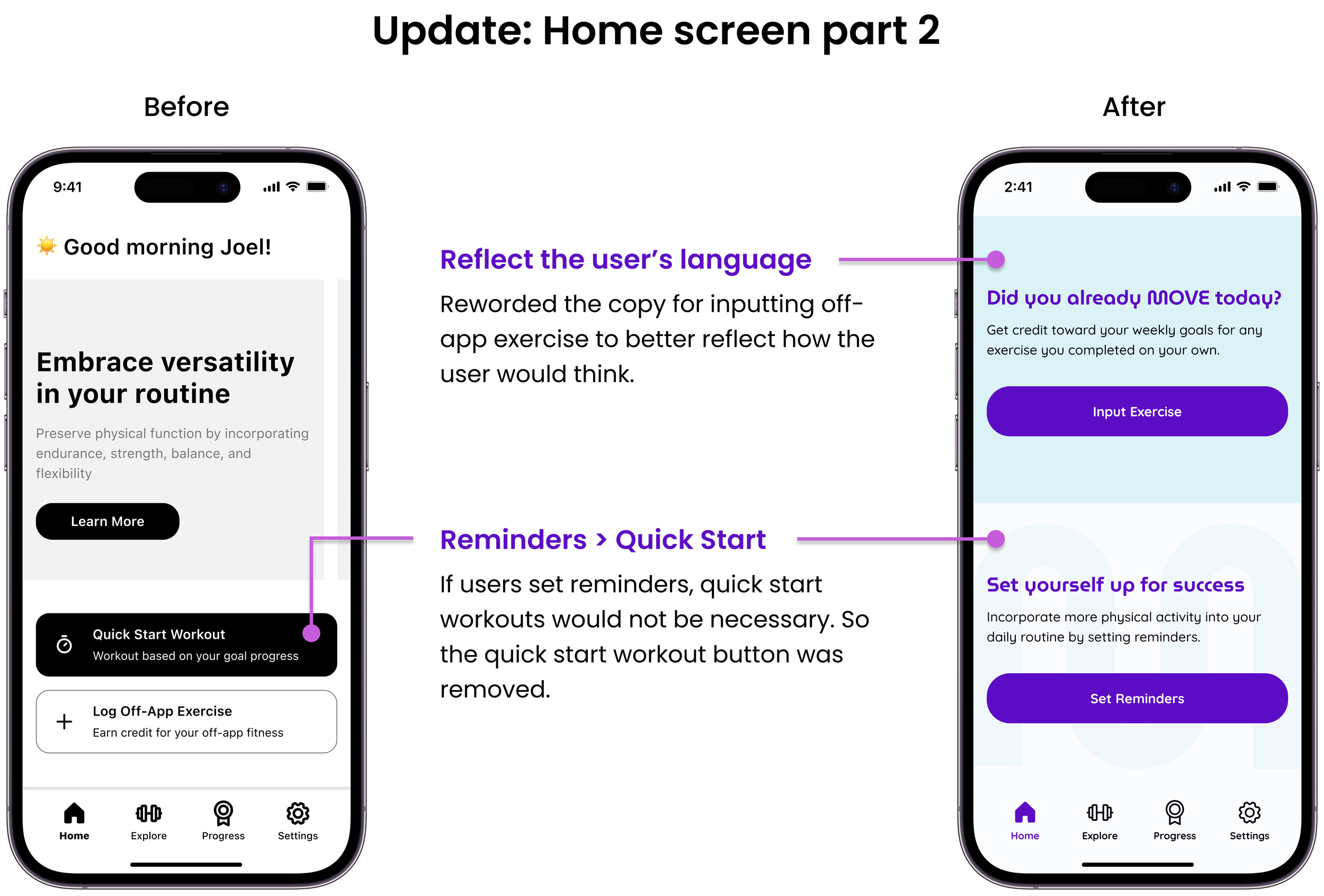
When usability testing, users’ instinct was to scroll, not swipe. While that may be due to there not being enough visual cues for the carousel, I decided to remove the carousel altogether and prioritize the content.
Priority revisions
Usability testing revealed multiple opportunities for improvement and user questions that led to new ideas. I sorted the new ideas/issues based on their potential impact on the product goals, frequency in usability testing, and estimated effort required.
While most users completed the tasks successfully, I wanted to help users feel more confident by improving overall clarity.


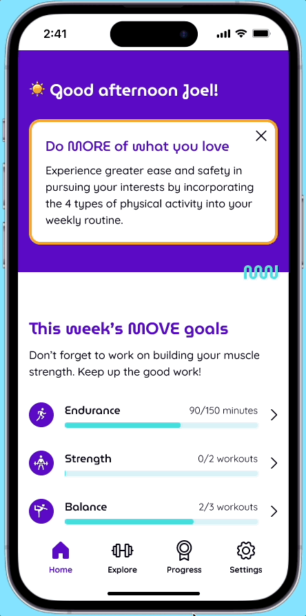
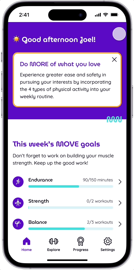
Increasing mobility + decreasing sedentary time with the Move More app
DELIVER
How does the Move More app address user needs?
The problem: Retired adults were concerned that their deteriorating health would impact their ability to live a more full life.
The solution: A fitness app designed for older adults that helps users increase mobility and decrease sedentary time by encouraging users to incorporate 4 exercise categories (endurance, strength, balance, and flexibility) into their weekly routines through reminders and goal tracking.


Where do we go from here?
How might we get funding?

One goal of the National Institute on Aging is to extend the healthy, active years of life. As a primary inspiration for this project, we could pitch a partnership with the National Institute on Aging to help update their exercise resources?
Medicare provides health insurance for those aged 65 and older in the United States. Could this app be included in the benefits for Medicare?
Additional features to consider

Customizing weekly goals
Some users expressed that their existing exercise routines exceeded the recommended time for Endurance.
Photos to match skill level required
A user stated that some of the workout photos were intimidating. There may be a need to find photos that show a more accurate representation of the skill level required for each workout.
What I learned
Researching existing research before user interviews can help narrow the scope of the project and help develop a hypothesis going into the user interviews. Researching existing research after user interviews can help with content development and identifying more relevant competitors.
Investing time in finding design inspiration for every element on every screen before sketching pays off in the wireframing process.
When you don’t know where to start in searching for branding inspiration, starting with what you don’t want can help!

NEXT PROJECT

End-to-end responsive website + branding